Creating Titles Using the Flip and Weld Features with Traci

Please welcome Traci to the blog today sharing this adorable layout with us.

Happy Thursday Lori fans!

I’m so glad to be here sharing a tutorial with you today!  This one is pretty easy, but I often forget that I can do this so I thought I would share a creative way to have fun with your titles. 

I’ve been saving a photo of my son for just the right layout idea.  I wanted to focus on the photo, but have a really nice element in the title or embellishment.  I decided to use a few of Lori’s wonderful files to create a really neat title for this picture.  Plus, fall is my favorite time of year, and it will be here before we know it!

1.  First, pull up Lori’s wonderful fall designs…the autumn leaves title, and the fall flourish.

 2. Next, move the title off to the side so you can focus on the flourish. Size the flourish to 6″ in the ‘scale’ window and click Lock Aspect Ratio and apply.

3.  Click on the ‘duplicate’ icon and then ‘duplicate right’.

4.  Both of the shapes are facing the same way…which will look a bit funny under the title, so highlight the left shape, right click, and flip
horizontally.

5.  Next, move the left shape over just enough to overlap the right one slightly.  Highlight both shapes, and then right click and hit weld.


6. Now, right click and flip vertically so the image is upside down.   This allows for a straighter line across the top of the shape for adding the title.

Next move the “autumn leaves” title back over onto the mat.  Ungroup both words by highlighting the whole title, right click and hit ungroup.

7.  To add an internal offset on top of the full title, first duplicate the title and temporarily move one off to the side. 

8.  Next, line up your title and flourish pieces so that they overlap slightly.

9.  Right click and hit weld to connect your border and title pieces all together.  Cut this piece out.

10.  To cut a smaller, overlapping title to cover the ‘autumn leaves’ portion,  highlight those pieces and click on the offset icon, and then ‘internal offset’. Zoom into the shapes to make sure that you can pull away the correct portion, and move the outer pieces off the mat. Finally, cut the internal offset portion in a different color.

And here is my final layout!
In addition to Lori’s flourish and title pieces, I also used the brand new paper and embellishments she designed for Echo Park, Reflections Fall.
Thanks so much for letting me share! Please stop by my blog at Artsy Albums to say hello!
Traci

Cropping in Silhouette Studio by Corri

Hi everyone!  I have a simple tutorial for you today using a new tool I recently discovered in Silhouette Studio.  It’s the crop feature and it’s super easy to do but very useful.  I used it to make a quick and easy name tag for my daughter’s backpack.

First, open this tag and border on your mat. I resized the tag to 5″w. Make a duplicate of your tag.

Line the the border up on top of your tag.

Select both items and then go to the Modify menu in the upper left of your screen.


Click on Crop.

It trims your border to fit perfectly along the edge of your tag.

I typed  Olivia using Lori’s Happy Font and embellished my tag with this butterfly and a sticker from the

Here and Now Collection that Lori designed for Echo Park.


I laminated it to make it more durable….so it was a little hard to photograph but it turned out very cute! I will be using the crop feature a lot.  It’s perfect for trim border for cards that have an unusual shape.  I also think it would be cute to trim a grass border to fit perfectly along the edge of an Easter egg.

Silhouette Tutorial Make Your Own Belly Band

Thanks for stopping by today.  I have a tutorial that I would like to share with you on how to take a shape and make it into a belly band.  I used the 7 Shapes files so using this technique, you could have 7 different belly bands or decorative edged paper to decorate with.
This cute litte pencil cup and Post It Note Holder would make a great gift for friends, teachers, coworkers, or even look great on your own desk.  I know that is where mine is going to stay.  Even in a world filled with digital devices, I find myself reaching for a piece of paper and pencil all of the time.
Here is a close up of the belly band that I created from the label.  I also decorated the outside of the Post It Note Holder so it looks pretty even without the belly band on it.
So to make the belly band for your own Post It note holder, just follow these few easy steps.
1.  Open up on your mat, the 7 Shapes from the Lori Whitlock store.  Ungroup them, and move away all but the bottom left shape.

2.  Go to the Replicate panel and click Row of Four.
3.  Click on the first one and nudge over to the second one until the edges are just overlapping.  Do this for each shape.
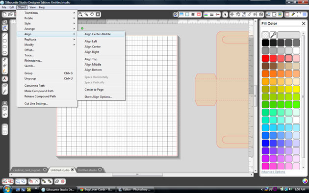
4.  To make sure that everything in lined up, select all, go to the Align panel, click Align Top, and then space Horizontally.
5.  Now go to the Modify panel, keeping all of the pieces selected, and click Weld.
6.  There will be a few of the middle pieces left.  Select them all and delete.
7.  This is what your welded shapes look like together.
8.  Now we are going to make the belly band part.  Draw a rectangle across the middle of the welded shape and make sure it extends about a half inch past both ends.
9.  Select both pieces and weld them together.
10.  Here are a couple more examples of belly bands that I created using the other shapes in the 7 Shapes file.
For my project, I had to manipulate the size of the belly band on both the pencil cup and the Post It Note Holder.  On the Post It Note Holder, I stretched it to make it longer and push the top down to make it thinner.  For the pencil cup, I copied and pasted a second one and overlapping them, I welded them together to make a longer piece.

I think it is fun to experiment with different shapes and see if I can make them into other things, like the belly bands.  I also used the Birthday Cake Box to create the pencil cup.  I only assembled the bottom so that it was open at the top.  The pieces that I did use were skewed so that the cup was taller than the original cake box would have been.
I also used the label shape a second time and sized it to fit inside one on the belly band so that I had a mat for the Remember This sentiment.  Stickers and paper from the Here and Now collection by Lori Whitlock for Echo Park make this a eye catching ensemble.
Lori Whitlock Supplies Used:
Sticky Note Holder 3  Holds up to 100 sheets of sticky notes
Here & Now Paper and Sticker Collection by Lori Whitlock for Echo Park

Blog Party + Vinyl Tutorial + Freebie

It’s Day 3 of our Blog Party! We have another FREEBIE at the end of today’s post so be sure to keep reading…
We have a fantastic vinyl tutorial today by CT member, Mendi. Thank you Mendi for sharing your expertise with all of us!
Here’s what Mendi has to say:
“Today I have an easy step-by-step tutorial sharing how to cut and use vinyl which I used on a simple little card (featuring Lori’s super fun Here & Now collection which she designed for Echo Park).  While vinyl is perfect for so many home decor projects, I  personally adore using it for my cards and scrapbook layouts.  It’s the perfect medium for cutting delicate files that would ordinarily shred cardstock.”

“I started off by planning the basic layout of my card by assembling it visually in my Silhouette software, changing the fill colors to get a feel for what papers I might want to use to cut it out.  I changed a couple things along the way (like my sentiment color since I was sad to discover that my hot pink vinyl was not a good match for my paper).”
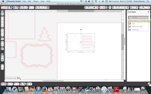
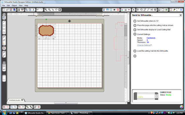
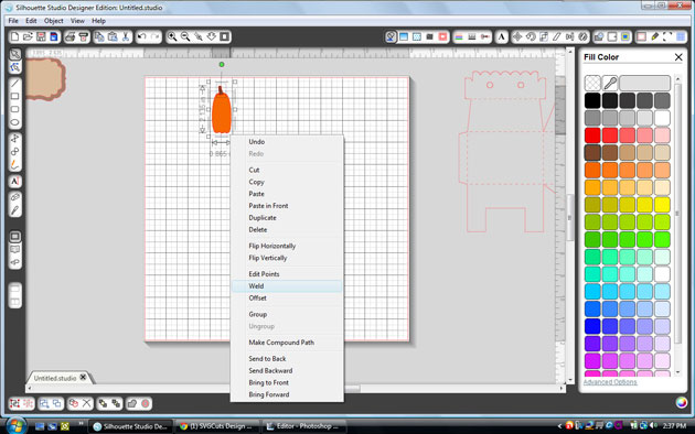
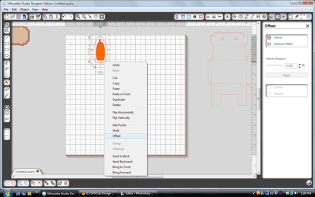
“I knew I wanted to cut the teeny-tiny bird legs and beaks out of orange vinyl, but they were all one piece with the branch so to get around that I made a duplicate and used my knife to isolate the birds and cut out part of the branch.  I could have cut it all off, but I decide to leave a portion to help me line up my birds just right during assembly.  The following screen shots show the steps I took to do this, deleting the extras portions I didn’t need.”

“I was now ready to cut my birds from the orange vinyl.  To do this I selected the vinyl cut setting from the menu.  With vinyl you have the option to adhere it to your cutting mat like you would cardstock or to insert it directly into your machine.  Personally I like to use my mat and use up small scraps of vinyl (and not mess with changing settings), but for the purpose of today’s tutorial I thought I would share another option. 

When using your vinyl without a mat you need to make sure to uncheck the box next to “cutting mat” within your cutting settings window.”


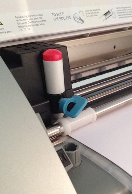
“If you’re using a Cameo, depending on the width of your vinyl, you will also most likely need to slide the rollers by following the directions on the inside cover of the machine.”


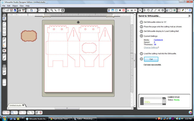
“Also make sure to change your setting from ‘load cutting mat’ to ‘load media’ and hit enter.”


“Change your blade setting to 2 (or in my case I accidentally took a picture of mine set to 3 which also works if your blade is getting dull).”


“After pulling my full-sized vinyl from the machine, I cut around the image to avoid waste and peeled off and threw away the negative portion of the image.”


“I then cut a small piece of transfer paper that was similar in size and peeled it from the glossy paper backing (if you’re thrifty like me, this can be saved and reused though so make sure to keep the backing it comes on to hold onto for another project).”


“Lay the clear transfer paper over your vinyl image (sticky side down) and rub with the popsicle stick it comes with (or bone folder or stylus).”


“Peel back the transfer paper and your image should now be clinging to the clear transfer paper.  If not you can help it along by rubbing stubborn areas again or sticking a fingernail in there to encourage it.”


“Now you are ready to adhere it to your actual project.  Once again your rub-it with your popsicle stick or stylus (and once again you repeat as necessary or stick a fingernail in between the transfer paper and your vinyl cutout to help it along).” 


“When images are not fragile or easily warped in their shape it’s possible to skip the transfer paper all together, but I personally love the transfer paper because it helps me line it up perfectly every time just the way it was on my computer screen.” 🙂


“I repeated these same steps to cut out the sentiment “love you” on my card.  With the small size I chose, this was even more fragile than the bird legs and would have been nearly impossible to do with any material other than vinyl.  I completed my card with more cute papers from the Here & Now collection.”


To create my card today I used the following cutting files designed by Lori Whitlock:

“For all those new Silhouette owners out there I hope I’ve taught you something new and for everyone else, I hope I’ve managed to inspire you to play with vinyl more and give it a try for your next intricate cutting project!”

If you’re interested in giving vinyl a try we have a super promotion going on right now!

You can BUY ONE GET ONE FREE on all Silhouette vinyl now through August 14! Here are the two deals you can cash in on…

(1)    Silhouette CAMEO®, 2 rolls of vinyl (chalkboard and white) and 1 roll of transfer paper: $269.99
(2)    Buy one get one free deals on all Silhouette vinyl (including transfer paper and stencil vinyl, too)

Be sure to shop using this link: www.silhouetteamerica.com/vinyl and use the coupon code LORI at checkout.

Are you ready for ANOTHER freebie? TODAY ONLY we have another FREE shape for you! This saying from Kolette Hall is perfect for cutting out of vinyl! Just incase you were not aware, Kolette Hall offers her SVG shapes in our online shop along with her Commercial use licenses for her SVG and Silhouette cutting files. Thank you, Kolette for sharing this beautiful FREEBIE today!

EXPIRED

Just a reminder… ALL SVG cutting files and fonts in Lori’s Shop are on sale, use coupon code SUMMER to get 30% OFF your entire order!

Be sure you ENTER TO WIN the Silhouette Cameo that we’re giving away!! The winner will be announced on Monday!

THANK YOU for joining our Blog Party this week! It’s been fun having you here with us! I thoroughly appreciate your support! My goal is to bring outstanding cutting files, paper, fabric, etc. to you! Just knowing that you enjoy working with the things I’m designing keeps me going! Thank you!

Silhouette Tutorial Filling Shapes with Digital Prints by Brigit

Hi everyone Brigit here with another SSDE Tutorial.  I love to fill my shapes with digital paper and then do a print n cut with my Silhouette Cameo.  It does such an awesome job cutting out the pattern filled shapes as you can see in the card below.

For this project I used one of the cards from the Christmas Card Set 2 and Lori’s digital paper collection Sweet Life.  I only used the card and the two front layers, you can delete the other pieces.

If you need help with ungrouping and making compound paths check out my tutorial here.

I do not import my digital paper into SSDE, I have it all organized by designer in a folder on my computer.  You can see in the photo how I have the folder opened onthe right-hand side next to my program.

I just dragged the pattern paper from the folder and dropped it into the shape.

Notice on the card the owl design is to the left and cutoff.

Select the card, go to the Fill Pattern and Advanced Options, click on the Pan Pattern, a circle with crosshairs will appear in the middle of the card, click on it and move the paper around.

I wanted my owl on the opposite side with the white swirls to the right so I clicked on the Horizontally under the Mirror Pattern.

I line up the card fronts so when panning I can see exactly where I’d like the owl to be.  I used the Scale Pattern and enlarged the paper to 110% so the edge of the paper wouldn’t show.  The scale pattern is great to make your pattern paper designs larger or smaller I use it all the time.

Lori has a cute owl and tree cut file that matches this collection in the owls set, I used the eyedropper under the Fill Color and selected colors from the collection so everything would match or you can fill them also with the digital paper.  The sentiment is an element from the Sweet Life collection, to cut that out you need to first do a trace, that will be covered in another tutorial.

All my pieces fit on one 12″ x 12″ piece of cardstock, registration is checked under the Registration Marks and I make sure all my cuts are selected under the Cut Style.  Now I’m ready to do a print n cut.

Other Supplies Used: AC White Textured Cardstock, In the Navy Trendy Twine, Brads

Thanks for stopping by, I hope this tutorial has helped!!  You can visit me at http://www.brigitsscraps.com.