Silhouette Tutorial Matching Colors with Traci

Hey Lori friends!
It’s Traci here with a tutorial for matching your Silhouette print & cuts to your favorite card stock.  Have you ever created a print & cut, only to find that after you printed it, it really didn’t match the paper or card stock you were using?  Maybe the greens were too blue, or the yellows were too orange?  Well, there are a few ways to solve this problem, and today we are going to focus on matching your card stock.
Before we get started, I will add one disclaimer…much of this technique depends on the quality and level of the ink in your printer.  If you are low on ink, the colors may not be as true as you might want them to be.  But I encourage you to try it and see how it works for you!
I use many brands of card stock in my projects, but for the purposes of this tutorial, I am going to use Bazzill.  The reason for this is because in order to use the Silhouette software to match your colors, you need to know the RGB code for each color.  Bazzill provides a few different ways for you to look up a color’s RBG code.  They have a paid app in the iTunes store that I use.  You can use the app to search a card stock name and find the RGB code.  Another way is to purchase Bazzill swatch books — these have the RGB code listed right on the swatch.  I am in no way affiliated with the Bazzill company, and I am sure there are ways to find out the RGB codes for other brands as well.
So let’s get started:
First, pull up the shape you want to use in the software and resize it if needed.
I’m making a card, so I resized this cute subway art to fit the front of my card. (I later made it a bit smaller).
To resize, click on the Scale menu to specify dimensions.
Next, right-click on the shape to “ungroup” the pieces if you want them to be different colors.
Go to the Fill Color menu (little paint bucket icon) and find the “advanced options” at the bottom of that screen.
Next, highlight one piece of the shape that you want to color, and then input the RGB code for your card stock in the boxes on the advanced screen.
Hit enter, and your card stock color will pop into your shape.
Repeat the step above by entering the RGB codes for each piece of the shape.
My RBG codes included values for Bazzill Garnet, Parakeet, Hillary, and Black card stocks.
Next print the shape.  I am not cutting this shape out with my silhouette so I just sent the image to my printer.
If you have a shape to cut out after printing, be sure to follow the guidelines for a traditional print and cut.
I also repeated the steps above to change the colors on this adorable “Jolly” label.  Just be sure to
ungroup all of the individual pieces of the shape to change each color.
And here is my final card and ornament box.  Although hard to tell online, the colors match very well, especially
the greens 🙂  Have fun trying this on your next print & cut!
Lori Whitlock Shapes:

Countdown to Christmas by Traci

Hi everyone!  I’m happy to be here on Lori’s blog today to share a fun Christmas project with you.  I decided to make a Christmas planner to help me keep all of my holiday details in one place.  Lori’s tabbed planner album is perfect for this.  I resized the planner to 6×8 so that it would fit in my purse, and created an inset for each page so that my pages were layered card stock and cute pattern paper.

I cut the covers out of chipboard so they would be a little more sturdy, and added a 4×6 chipboard piece to the front of the cover for added dimension.
Lori even designed page inserts (calendar pages, grocery lists, menu planner, etc.) for the planner and they are available at Jessica Sprague’s site.  You will find all of the links to the cutting files and the page inserts below.
I plan to keep gift lists, menu plans, christmas card ideas, to do lists, and travel plans in my planner.
Shapes:
Page Inserts:
I will have a few more photos posted over on my blog today.  I’d love for you to stop by and say hi!

Silhouette Tutorial: A Fun Tip for Using Sketch Pens with Traci

Hi everyone!  I have a fun tip to share with you today for using your Silhouette sketch pens.
‘Tis almost the season for sending out Christmas cards, and if you’re like me, the task can often be so time-consuming that I lose sight of the meaning for sending them out in the first place.  This year I remembered I have a silhouette and sketch pens and it’s going to make creating my cards a lot more fun.
The sketch pen technique that I want to share with you today involves cutting a shape from inside an offset that’s been drawn with the pens.
So here is the card I created using this technique:
1.  First I started with Lori’s adorable Christmas Tree Pop Up Card.
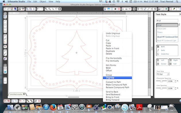
I ungrouped everything and moved everything off to the side except the front panel with the tree.
2.  Next, I ungrouped this one shape so that I could move the tree over to the left side of the shape.
 
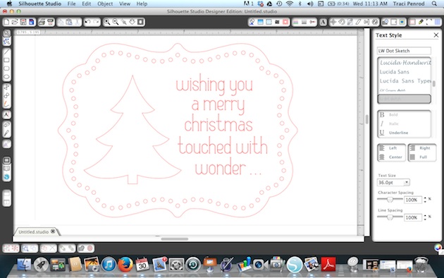
3.  Once I moved the tree over to the left, I had space to put a sentiment.  Using Lori’s Dot Sketch Font, I typed in the sentiment that I wanted to use and centered everything the way I wanted it to look once it was sketched.
4.  In addition to the sentiment, I also wanted an offset drawn around the tree cut out.  To do this, I highlighted the tree, and opened the offset window (6th icon from the right in the top toolbar).  I clicked offset and set it to .05 distance.
5.  For the next step, I moved the inside tree shape, and the outer card shape, off to the side.  These portions will be cut out, so I didn’t want them to get sketched when I insert my pen.
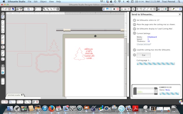
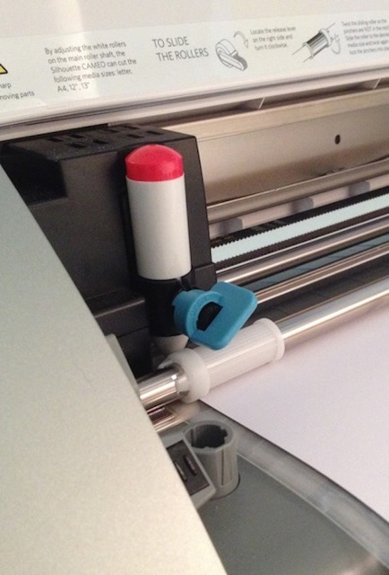
6.  Next, I loaded white paper into my silhouette cameo machine and removed the blade.  I replaced the blade with a red Silhouette sketch pen and locked it in place.  Then I made sure my cut settings were set to Silhouette Sketch Pens, and I clicked “Cut”.
7.  Here is an important step!  Once the sketch pen was finished drawing my lines, I didn’t remove or unload my paper.  The reason for this is because I want it to line up perfectly again when I go to cut the inside shape out of my tree.  So I left the paper loaded exactly as it was when it was finished, and went back to my software.
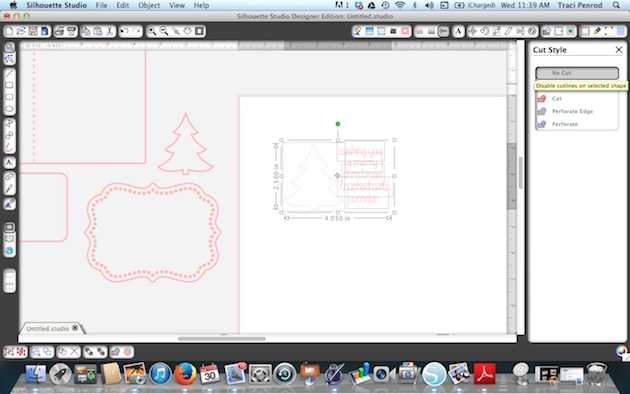
I highlighted everything that I had just sketched, and clicked on the Cut Style window.  I chose “No Cut” so that when I replaced my red pen with a blade, everything I just sketched didn’t get cut out.
8.  Next I moved my card shape (which IS highlighted to cut) and the inner part of my tree (which IS highlighted to cut) back in place. I made sure that I replaced my red pen with my cutting blade, adjusted the cut setting to card stock,  and hit the cut button again to tell my machine to cut out just those areas around my sketch.
9.  For the inside of my card, I repeated the steps above to create a personalized “sketched” message inside the card before I cut it out.
One last tip — I used a large needle to help thread my twine through the holes in the front of the card.
Thanks for stopping by today!  I hope I’ve given you a few new tips on using your sketch pens!

Silhouette Tutorial by Traci

Hi everyone!  I’m excited to be sharing a neat tutorial with you today.  Have you ever thought about using photos in your Silhouette software?  I had never given this much thought until recently when I wanted a banner to match my pictures.  I will walk you through this technique today, and give you three different shape ideas for using photos with your Silhouette or Cameo machine.
First, choose a photo and a shape that you want to use.  For my layout, I knew I wanted a banner at the top of the page that matched my pictures. I work on a MAC, so I can just drag my photo into the software, but another option is to click on “File” at the top, hit “Open” and then choose a picture from your computer.
Once you have both your photo and shape(s) open, drag the shapes off to the side, ungroup and resize as necessary.
(For my banner, I didn’t want the little holes at the top of each piece so when I ungrouped them, I deleted the holes).
Enlarge your photo if needed to accommodate the size shape you want to cut out.
In order for you to see everything better, I made my shape lines black and thicker…but you don’t have to do this.
Move your shape(s) over on to your photo and place everything where you want to cut it out.
For mine, I wanted the varying leaf colors on each of my banners, as shown below.
I zoomed back out on this screen shot, but once all of your shapes are in place, go to the “Modify” window (little icon in upper right corner with the M).
With all pieces highlighted (photo and shape), click on “Crop” — this removes all areas which are not shared by at least two shapes.
Once you click “Crop”, you are left with the shape filled with your photo.
Here is another example that I used for this project.  I cut this cute picture of my son into a tag by following the same directions as above.
Once you have your shaped photos, you will want to highlight everything and open the cut style window (little scissor icon).
Be sure that the cut lines around your shapes are red by clicking on “cut” on the “Cut Style” menu.
Now you will treat this just like a Print and Cut.  (See an earlier tutorial on Lori’s website for Print and Cut directions).
Here is the layout.  As you can see, I also created offsets for the banners and tag to help them pop off the page a bit.
The offset feature can also be found in another tutorial on Lori’s site.
I hope you enjoyed this tutorial.
Here is another example using a photo to create a matching title 🙂
Have fun with this technique!  I’d love to hear how you will use photos in your Silhouette software so
please visit my blog at www.artsyalbums.com and share your ideas with me!
Traci
Lori’s Cutting files used in this project:

Layout by Mendi + Canvas by Traci

Today we have two beautiful projects to share with you by Mendi and Traci. First to share with you is Mendi.
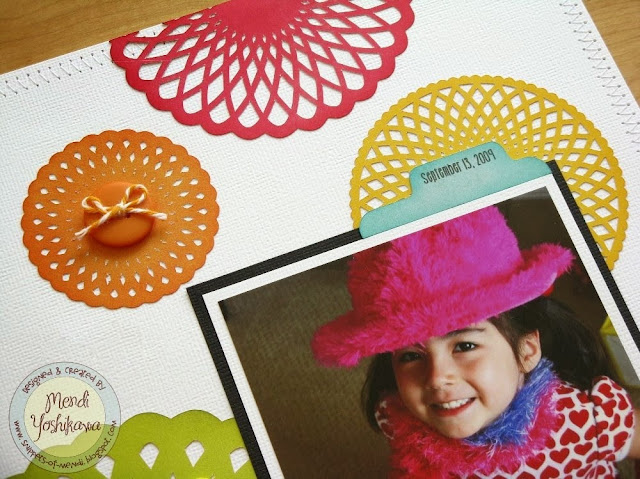
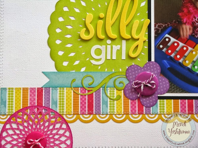
I’m so excited to finally be sharing this layout today!  I actually started this one back in May and was just waiting for the perfect moment to share it between all the Summer and Fall themed occasions.  For this project I turned to my all time favorite collection of Lori’s called Summer Days which she designed for Echo Park, along with a number of her awesome cutting files.


I’ve had this photo of my daughter in my photo box for nearly 4 years waiting for the perfect rainbow inspired layout to use it on.  As soon as I saw Lori’s doily cutting files I knew it would be so much fun to cut each one from a different color for a clean and simple layout.  I love the way they look cut from the different solid colors from the collection!


If these shapes look like a bit of fun to cut out, you would be correct.  They definitely leave their fair share of confetti on your cutting mat so make sure to have a scraper or old gift card handy to get all these little guys off. These beautiful doilies were more than worth the tiny bit of extra effort though.  😉


To complete my layout I used the following cutting files available for purchase in Lori’s Shop:
Next up we have Traci with a beautiful wall hanging.
Happy Fall everyone!  Do you love this time of year as much as I do?  The colors of the leaves, the cooler temperatures, the sweaters … love sweaters!  I have a great home decor piece to share with you today since fall is officially here.  Lori’s 6×8 Canvas set is such a fun project and so versatile — you could make one for each season!  The cutting file comes with even more than you see here — not only are the two hanging “canvases” included, but 4 different mat shaped backgrounds are also in the file!  You could hang two like I’ve done here, or hang three, or even more!
The paper collection is one of my favorites this season — Echo Park’s Reflections Fall, designed by Lori.
I also love Lori’s title “A Thankful Heart is a Happy Heart“.  You can find it with 4 other fall titles in Lori’s shop, or in the Silhouette shop.
Thanks for letting me share this canvas wall hanging with you!  Please stop by my blog and say hello today!  I’ll be giving away a $10 Silhouette download card to one lucky winner!
Have a wonderful week!
Traci