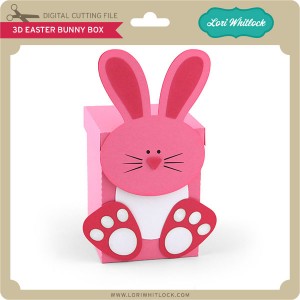
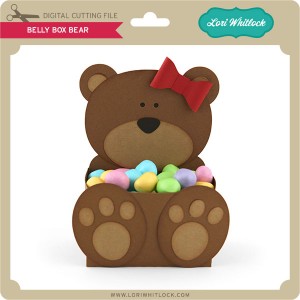
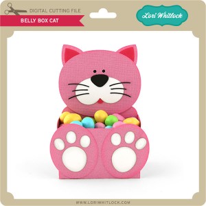
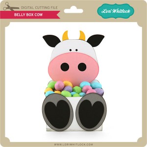
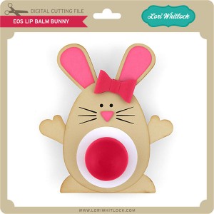
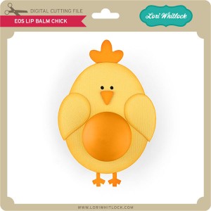
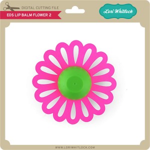
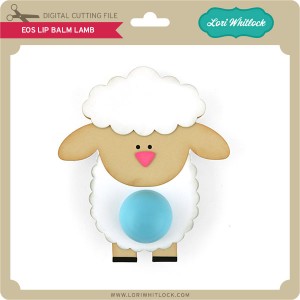
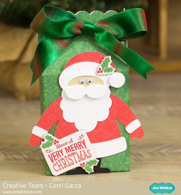
TODAY & TOMORROW, this SVG file is FREE with Purchase.
First off, I wanted to talk to the Cricut Explore users out there. Cricut just launched Design Space 2.0. The good news is that SVG files now come in at the original size!! This is so great. There really isn’t any need to reference the “cut size” info any more. If you have any issues with score marks staying in place please contact me for updated files. I am more than happy to help you get files that are working smoothly for you. I promise that I’m working hard to make sure my files are Cricut Explore compatible. Each time they upgrade their software, it seems to bring up a new issue, but I will make sure my customers are happy and get you the files you need. And, once I update a file, I am replacing it in the shop so future customers are receiving the most current file. Please contact me right away if you have any concerns with your files by emailing me at info@loriwhitlock.com. I love my customers! Without you, I would not be designing. Thank you for your loyalty.
We have an adorable free file with purchase today! Simply add this file: Pocket Ring Mini Album to your shopping cart along with any $2 purchase from www.loriwhitlock.com/shop and this file is yours FREE. Your cart must reach at least $3.98 before the coupon will be applied and then $1.99 will be subtracted from your total at checkout. The files will be available for immediate download after you pay for your order. Be sure to use Coupon Code: MINI (case sensitive) at checkout. Hurry! This offer is good until Wednesday (tomorrow) at midnight!


All or our files now come Cricut Explore friendly. If you need updated files, don’t hesitate to ask by emailing us HERE. As we update the files, we are replacing them in the shop for future customers. If you need PDFs for hand cutting and they are not included in the file, also feel free to email us.
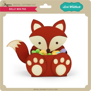
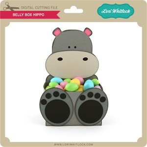
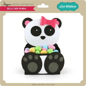
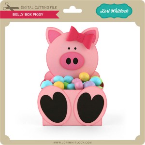
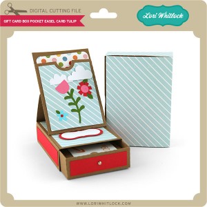
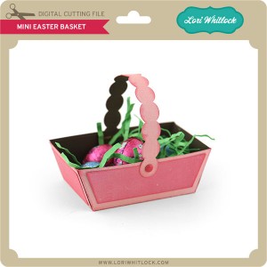
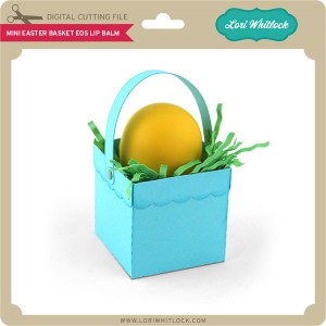
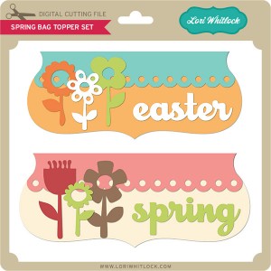
Finally… we have a HUGE NEW release this week in the SVG Shop, and they are ALL on SALE 25% OFF through the weekend!!! These downloads include SVG files. 3D files include cut size information and a PDF for hand cutting if desired. Read description before making your purchase.
To find these files in the Silhouette Design Store click HERE.

