Fonts are Awesome!

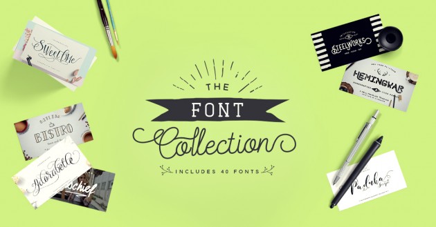
Many of you saw my post a few weeks ago HERE showing you how to use glyphs in Silhouette Studio. I wanted to make you aware of another great font bundle for just a few more days called “The Font Collection.” FontBundles.net has done it again with this offering of $571 worth of gorgeous fonts for just $29. Yep, you read that right just $29. This is an amazing way to collect several great fonts for under a dollar each and most of these fonts include glyphs which will cut beautifully on your Silhouette CAMEO or Cricut Explore machines. But, this deal won’t last forever, it will be gone in 14 days.

Be sure to go visit THIS video to learn how to use Glyphs on a Mac in Silhouette Studio. And, if you’re on a PC THIS video will teach you what to do.

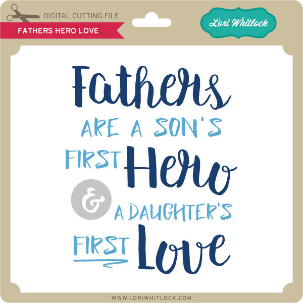
Now a gift for you!  I’ve created this fun file for you with the Summter and Lightening Sans Fonts which are part of this new collection!

Click HERE to download the FREE Silhouette Studio and SVG file for the “Fathers Hero Love”  phrase.   I hope you enjoy this FREE file… and be sure to go pick up the The Font Collection while it’s still available.

And be sure to check out these other bundles over at FontBundles.net!  They are the perfect way to add to your font library!

Auction Style Fonts Bundle

Sandy Font

They also have FREE Fonts available HERE.

Have a great day!

Tri-Fold Shadow Box Card Tutorial with Courtney

Hey all! It’s Courtney Lee from Court’s Crafts here with your Thursday tutorial!

Okay, so this is both a tutorial and a “what you can do with the product” tutorial so I am going to show you the traditional way this is put together, but I am going to then deviate slightly by making the stars into mini shakers.. so hang with me.

Before you start anything when you import to the Cricut Design Space software you want to right click and ungroup everything. Then you want to highlight a whole segment and “attach”. The reason you want to do this is so that the scoring lines actually end up in the correct places. It’s a weird funny “glitch” but if you don’t then the scoring lines think they want to cut out of black and even if you make them white they still will try to “cut” as a different object. This took me quite some “you-tubing” to figure out. 🙂

First of all I duplicated both the mirror looking layer and the background rectangle. The extra mirror looking layer is for the front of the card and the extra background rectangle is for acetate to make this a shaker-shadow box. Those are shown as a red piece and a black piece (not pictured) respectively on my screen shot. I’m so sorry I cannot get all of it into view! The Cricut software doesn’t put it on different mats it just puts it in different colors (or you choose them) and it divides it onto different mats accordingly. I LOVE it for saving me time, but it’s not super for pictures for a tutorial. 🙂

Step 1: I adhered the red polka dot panel (the extra mirror looking layer) to the front of the card.

Step 2: I adhered the red polka dot rectangle to the back middle of the card.

Step 3: Adhere the acetate to the back of the tan and white polka dotted panel.

Step 4: I added the foam dimensional tape around the stars and then added a second layer of tape to increase the thickness and then fill the stars with sequins.

Step 5: Put the cream layer upside down onto the foam dimensional tape. Line it up by using the top and the bottom line of the bottom panel.

Step 6: Put liquid glue on the skinny sides of the cream layer, the outside of the whole panel you have been working on, and the top and bottom of the “box”.

Step 7: Tuck the top and bottom of the box in between the cream layer and the rocket layer.

Step 8: Adhere the panels to the sides of the frame and decorate! 🙂

Recipe:

Lori’s Shop: Tri-Fold Shadow Box Card: Birthday

Silhouette Shop: Tri-Fold Shadow Box Card: Birthday

Lori Whitlock’s Pinstripes collection for Echo Park Paper

Pinstripes: Boy Bingo Cards (PS104010)

Pinstripes: Rocket Ships (PS104005)

Pinstripes: Alpha Stickers (PS104015)

Pinstripes: Adhesive Chipboard (PS104022)

Pinstripes: 6×6 Paper Pad

acetate

liquid glue

tape runner

Chalkboard Card for a Teacher Using Cricut Design Space with Karin

I made this adorable chalkboard card that you can use to give a special teacher a gift card.

20160517-2016-05-16_23-30-50
To make the card, I brought the files into Design Space by choosing Upload Image.
20160517-2016-05-16_23-33-57
I opened the image of the cutting file (JPG) in Preview on my Mac and just moved that window onto the screen next to the cutting file pieces so I could see the colours used in the original project. In this case, I loved the colours because they are nice and bright so I used all the same colours for my card. I even had a great piece of wood grain patterned paper.
20160517-2016-05-16_23-36-15
To change the colours of the components in Design Space, all I did was click the piece, that piece is highlighted in the Layers panel, then I clicked the scissors icon and then the colour I wanted for that piece.
20160517-2016-05-16_23-42-03
Here you can see that I changed the colour of these tabs to red.
20160517-Screenshot 2016-05-16 23.58.59
Before clicking Go, I selected the individual pieces by drawing a rectangle around them and then I right clicked and chose Attach. This is so that the little circular cuts and scoring lines stay in the right place on that particular piece.
20160517-_MG_5129
After I cut and assembled the pieces, I used some baker’s twine to string the banner pieces along.
20160517-_MG_5130
I put knots in the baker’s twine to attach the legs at the front and back.
20160517-_MG_5131
I just used my ATG gun to put adhesive on the back of the iTunes card and attached it to the back of the card.
20160517-_MG_5132
I stamped a sentiment on the front of the card. The You Rock stamp is from the Avery Elle Celebrate Stamp set. I used American Crafts Zing Embossing Powder in White Opaque Finish, my VersaMark watermark stamp pad and my Ranger Black Heat Tool for the sentiment.

20160517-_MG_5133-Edit-Edit

Thanks so much for stopping by. Please visit my blog for more fun projects. Also, if you would like to be informed whenever I upload a new Cricut video tutorial, you can sign up for my Cricut Tutorials mailing list.

Book Box Tutorial with Kathy

Hi Everyone, it’s Kathy today with a tutorial showing how to assemble Lori’s new Book Boxes.  These boxes are so cute and come in three different sizes!  I used the Small Book Box as a gift card holder for my daughter’s  English Teacher… he has been so helpful, writing college recommendations, helping to edit essays and providing much morale support, she wanted to make sure he knew how much he is appreciated!

I started by cutting the pieces out using Lori’s Pinstripes Collection for Echo Park.  For the book “cover” you want to run it along the edge of your desk or table to curve the spine area.  The same for the spine cover (blue).

The first assembly step is to glue together the main box piece, making sure the tabs are inside the box.

Next, I added the “pages” strips to the side and the bottom of the box.  Be aware, the bottom page piece is supposed to stick out a bit further then the box bottom.

Next I added the decorative panels to the book cover.


I then added the spine cover, making sure to line up the outside score lines.

***  A quick note on the last two steps… I did it in the incorrect order… You want to add the spine piece first, then cover with the cover pieces, but mine was already glued… it still looks great, but goes to show, even the “experts” make mistakes!!

The next step is to add the cover to the box.  You want to line the edges of the open end of the box up with the outside score lines on the spine of the cover.

I found it easier to do one side at a time.

All that’s left is to add the outside embellishments!  I used some gold sticker paper I had in my stash to make the corner protectors.

I used the stickers from the Pinstripes collection to write a Thank You “title” on the spine.

That’s it for me today, thanks for stopping by to peek!

Using Digital Brushes and Stamps with Rachael

Hello, all! Rachael here today, to show you how to use brushes and stamps on your digital layout. I will be demonstrating this technique in Photoshop CC, but the principles are the same in Photoshop Elements. Let’s go ahead and get started, shall we?

For this layout, I used a solid yellow paper as the background. Solid papers are a great starting point for adding brushwork.

The first step is to create a blank layer for your brush strokes:

Next, you’ll want to activate the brush tool. In Photoshop, this tool looks like a paintbrush and can be activated by using the hotkey (B) on your keyboard. Once the tool is activated, you could go ahead and use the default brushes. However, we are going to use some of Lori Whitlock’s very cool brushes in this layout. To load additional brushes, click the drop-down arrow next to the currently active brush:

The brushes window will open, displaying all available brushes in the current brush set. Click the gear icon in this window to load new brushes:

The next window gives you a series of options. You can either Reset the brushes, which replaces the brush set with the default brushes; Load brushes, which appends the brushes in the new brush set to the existing brushes; or Replace brushes, which replaces all loaded brushes with the ones in the brush set you select. There are, of course, numerous additional options within the menu, which you can explore and experiment with as you see fit. For now, go ahead and select the “Load Brushes” option.

Navigate to the folder that contains the brush set you wish to use, and double-click to load the brushes.

To view the brushes in the brush set, click the drop-down arrow next to the current brush (refer to the second step, above). This menu displays a thumbnail icon for each brush in the brush set. Select the brush you wish to use, and set your foreground color.

Go ahead and place your curser, which should now be in the shape of your brush, in the location you desire.

Since you’ve placed the brush stroke on its own layer, you can move the brush around and rotate or manipulate it as needed, just as you would any other design element. You can also change the blending mode of the brush layer, to get different results. For this next brush stroke, I stamped in black and then changed the blending mode to Overlay and reduced the opacity to 40%:


Digital brushes and stamps are a fun and easy way to add complexity and depth to your layout. Feel free to play around with the options and find what works best for you.

I hope this inspires you to try something new!

The following products were used in this layout:

Echo Park (designed by Lori Whitlock): For the Record Collection

Flourish Brushes

Everyday Stamps

Everyday Stamps 2