Silhouette Tutorial: Adding A Window with Corri

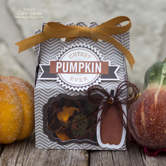
Hi everyone!  Corri here today with a simple tutorial to show you how to add a window and frame to your favorite treat bag.   I just love Lori’s gable box file….it’s so simple to assemble making it great for a last minute gift.

I love having the window in the box so you can get a peek of what’s inside.

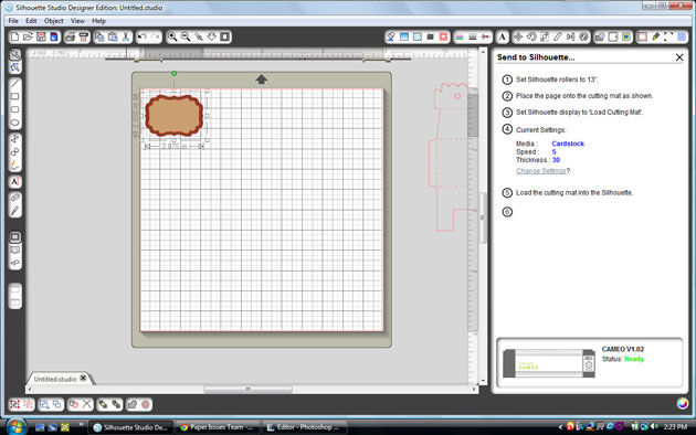
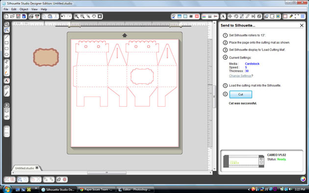
To add a window to the box,  I selected a label from this set.

Size the inner shape at 2.5″w (check the aspect ratio box) center it on top of the gable box.


Size the outer label shape to 2.875″w and center the two shapes.  This will cut your frame piece.


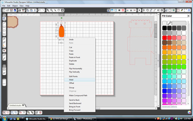
I opened the tall pumpkin from this set. After cutting the two pieces,  I welded the stem to the base using the weld feature.  Select both pieces and right click and pull down to weld.


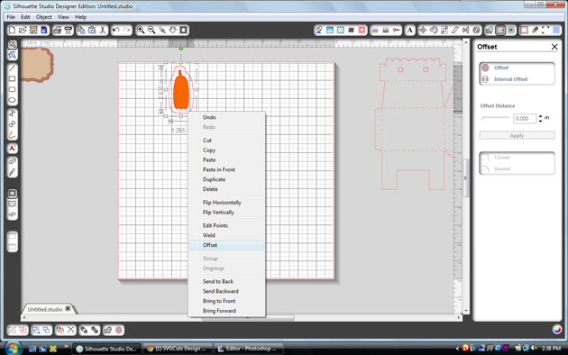
To create a shadow for your pumpkin, select the pumpkin, right click your mouse and pull down to offset.

Silhouette Tutorial: Sketch Pens

Have you used the Silhouette pens yet?  Well I have and have found that they are so fun to use and very versatile.   Today I have a few simple examples of how you can use the pens and then a tutorial to show exactly how easy it is to create with your own set of pens.
Lori has a bunch of fun Life Cards in her shop and I so I want to show you how you can embellish or journal on these cut files with the Silhouette pens.  My first example is a 3×4 Life Card that has a speech bubble cut into it.  I simply typed a title in the space of the bubble using Lori Whitlock’s cursive sketch font.  I’ll explain the steps on how to draw and cut your shapes below.
My second example uses the same Life Card but this time I am demonstrating how you can use the pen to do your journaling.  No need to do print and cut.  Just use your Silhouette pens. Lori has plenty of fonts to use for your journaling and the pens come in many colors so you’ll really be able to personalize your cards perfectly.
My third example is part of my tutorial.  When cut in it’s original shape, the hearts are actually cut out.  In my version I show you how you can draw the hearts instead of cutting them.  This simple technique will extend the capabilities of your digital cut files tremendously.
I’ve put together some screen shots to show you exactly what you will do to duplicate the card above.

1.  Here is what my original Life Card looks like.  I ungrouped it from the three other cards that came with it and left it the same 3 x 4 size.

2.The first thing that you will want to do is to make sure all of the pieces in the shape are ungrouped.  For this particular file, the hearts and the card shape have been combined into a compound shape because the hearts are normally cut outs.  So before you ungroup the piece, you will first need to, click the image, then go to the top menu and select Image and then Release Compound Shape.  You will then see your shape look like the picture above.  The hearts are there, they are just underneath the card piece.  (Note:  Not all files will require you to release a compound shape.  If your shape is not a compound shape, then you can just ungroup, and move to step 4)
3.  Then select all, CTRL-A, and ungroup, CTRL-U.
4.  Now we are going to go to the Cut Style menu.  This will make it easier for you to see all of the pieces of the file.  As you can see, when the Cut Style menu is open, the lines that will be cut are outlined in dark pink.  Changing the options on each of the cut lines, is how we are going to create using the Silhouette pens.
5.  The first thing we want to do is to select the outside line of the card.  When it is selected, click on the option No Cut.  This will mean that when we replace the blade with the Silhouette pen, that outline will be ignored, or Not Cut.  The pen will only “cut” or draw the hearts.  Do not change the option for the hearts at this time.
6.  Now it is time to draw the hearts.  When you click the Silhouette Cut Settings button, your view of the card will change back and you will only see the card piece again.  Don’t worry, the hearts are still there.
7.  Place your paper on your mat and load it into your machine.  Replace the blade with your selected color of Silhouette pen in the blade holder.  Make sure to close the blade holder by turning the blue piece.  Go to the menu on the screen and change the Silhouette settings to the Preset, Silhouette Sketch Pen.  Then click cut.
When it is done, do NOT unload the mat from the machine.
8.  Now we are going to cut the card out.  Go back to the Cut Style menu.  We want to cut the outside line and not cut the hearts this time.  The easiest way to do this is to Select All, CTRL-A, and then click No Cut.
9.  Then click the outside line of the card, and change that to Cut.
10.  Then go back to your Silhouette Cut Settings.  Take the Silhouette pen out of the blade holder and replace it with the blade.  Lock into place.  On the Cut Settings menu, select the Pre Set setting that corresponds to the type of material that you are cutting.  I was using white cardstock so I chose the Cardstock setting.  When ready, click cut.  Unload machine and take off your Life Card.
Here is one more example of the heart Life Card.  To do this, I selected certain hearts each time I sent it through the Silhouette machine to “cut/draw” and each time I switched out the color of pens to create the rainbow effect.
Lori Whitlock supplies:
Life Cards  (Silhouette Store)
Here & Now 6×6 paper pad by Lori Whitlock for Echo Park
Other Supplies:
White Cardstock
Silhouette Pens- original colors
Silhouette Tutorial Print & Cut by Mendi

I’m excited to be back today to share a Silhouette video tutorial with all of you!
Today’s card and video shares several little tricks and tips, but my primary focus was to share how to take one of Lori’s many versatile shapes and to personalize it to create your own customized “print & cut” file.  The creative possibilities using this basic idea are endless which is really exciting!
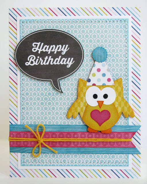
I decided for my card it would be fun to make a chalkboard themed speech bubble to match the feel of Lori’s “Here & Now” collection using one of her everyday shapes, sentiments and digital paper files.
To create my project I used the following cutting files designed by Lori:
Patriotic Icons (Ice Cream Cone)
Heart Flowers (Pom Pom–Silhouette Store Only)

The chalkboard paper I used can be purchased at Jessica Sprague here:

Silhouette Knife Tutorial

Hi friends!  I’m excited to share a sweet card and tutorial with you today!
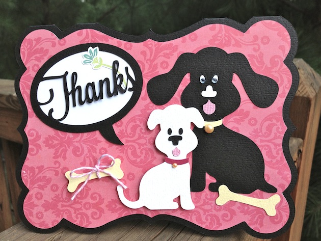
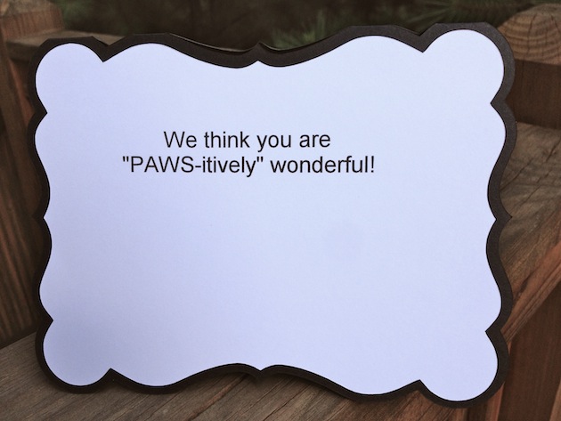
I recently went on vacation and had my son’s fiancé stay at my house with my dogs.  I decided to make a thank you card for her, and wanted the dogs on the card to resemble my pups.  I love Lori’s cute dog cutting file, but one of my dogs has a shorter tail, and one has shorter ears…so here is what I did to fix this.
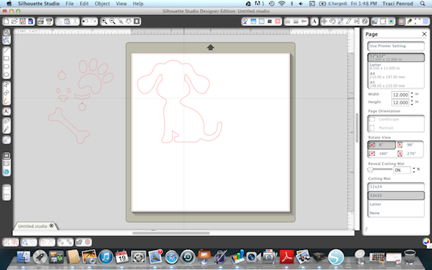
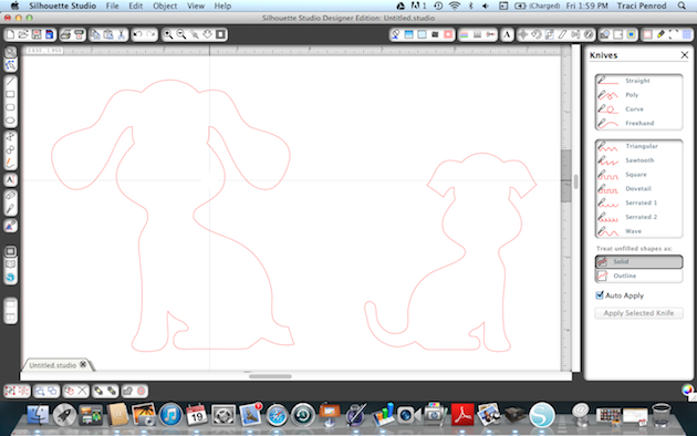
1. First I pulled up the dog shape I wanted to use.  I resized and ungrouped all of the pieces and slid the shapes that I didn’t want to use right away, over to the side.
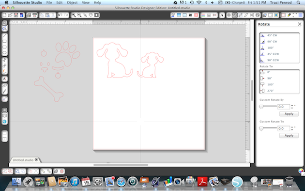
2.  Next, I highlighted my dog and duplicated the shape.  Since one of my dogs is smaller, I resized one, and flipped her around so that they weren’t facing the same way.
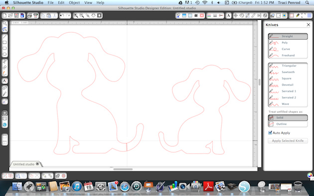
3.   Before I cut my shapes, I zoomed in on them so that I could see the cut lines better.
4.  I used the knife tool along the left hand tool bar.   I clicked on the line to start my cut…and then clicked on the line where I wanted my cut to end (notice the first dog’s tail).
5.  I did the same step for cutting the second dog’s ears to make them shorter.
Once the cut line was created, I used the ‘move tool’ (top arrow) and then clicked on the pieces to move them off to the slide.
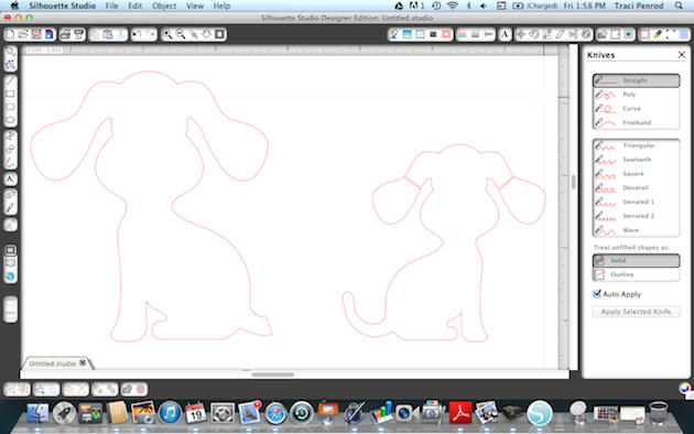
6.  The photo below shows where I have used the knife tool to cut one dog’s tail and the other dog’s ears to make them look like my adorable pups 🙂
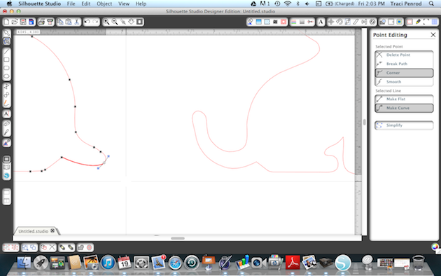
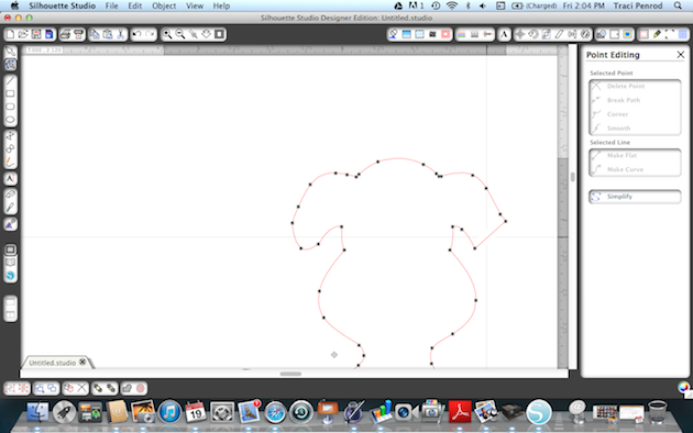
7.  Since I don’t want my dogs’ tail and ears to be square, I used the “edit point” (second arrow with dots) tool to round these areas out.  If you click this tool, you can pull your points around into the shape you want.
8.  This shot shows how one of the ears has been rounded.
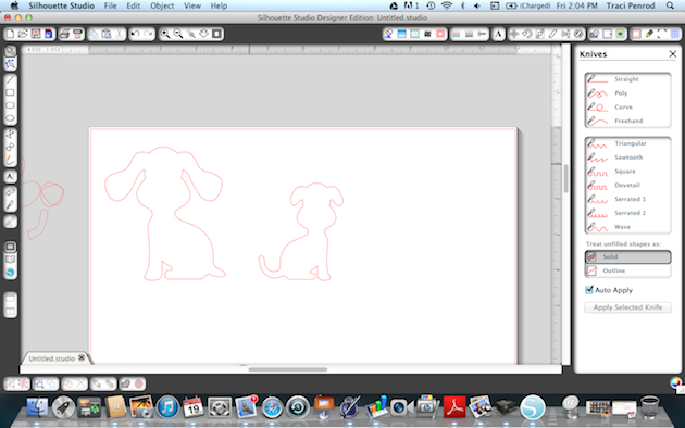
9.  Here is the final way my sweet dogs looked before I cut them out…
And here is the card I created with my new shapes.
Lori Whitlock cutting files used on this project:
Thanks for visiting Lori’s site today!  Please pop over to my blog at Artsy Albums to say hello!

Silhouette Tutorial by Corri Using the Offset Feature

Hi everyone! Corri here.

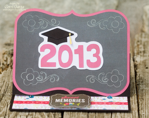
I have a quick tutorial for you today using the Offset feature in Silhouette Studio software. The offset feature is great for creating a shadow layer around your image.

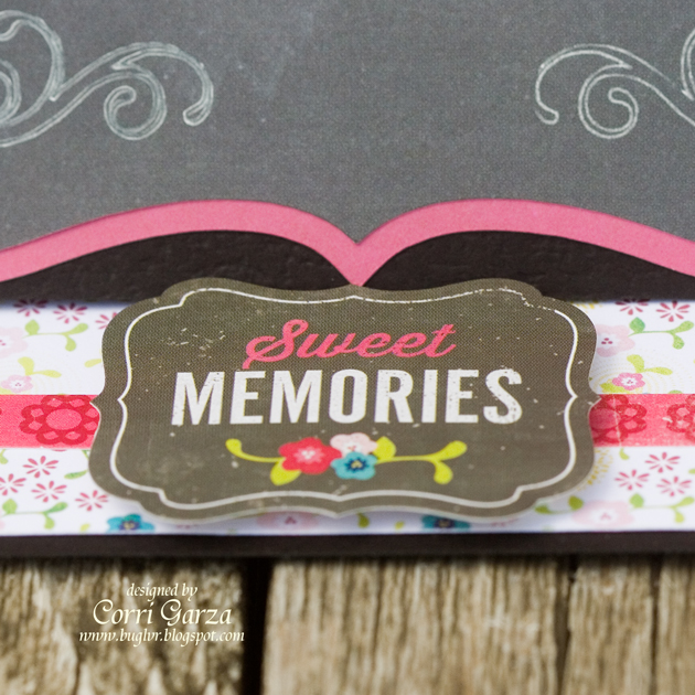
I used paper and a sticker from the Echo Park “Here & Now” Collection .  I love the chalkboard paper!


First, I typed 2013 in Lori’s Happy Font at 1.5″h.

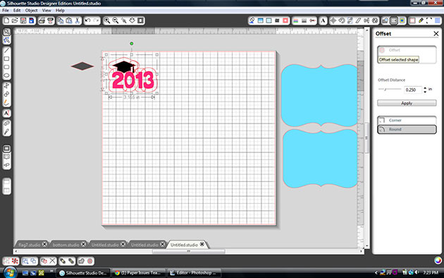
Next, I opened this graduation cap file, ungrouped and deleted the 2012. I sized the cap file (including both layers) to 1.75″h and positioned the cap’s base layer on top of the numbers. Select the offset menu from the tool bar in the upper right of the screen and click offset.

You can adjust the slider to make the shadow smaller or larger.  I left it at .25 so that I wouldn’t get a cut out in the middle of the “O”.


Click apply.


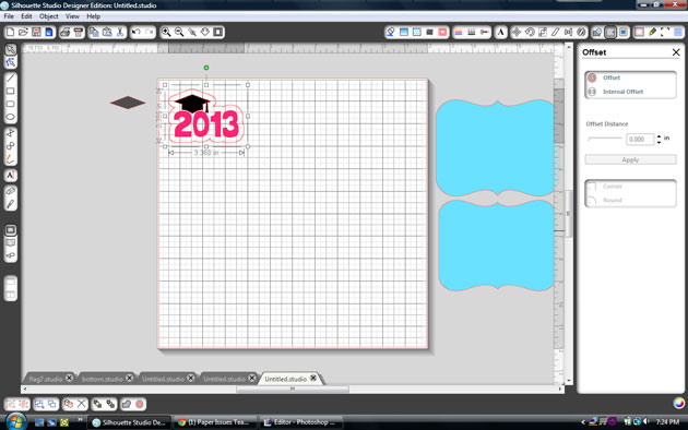
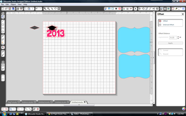
To create a little tighter shadow, click the new offset layer that you just created and click internal offset and then apply.    Now you can drag the layers apart and cut.


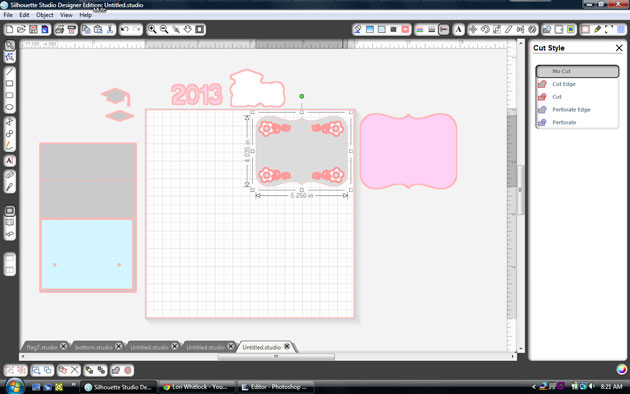
For the base of my card, I used the Easel Bracket Card.  I used my new sketch pens to draw this pretty flower flourish in each corner.

To get your Cameo to sketch the flourish, first select the bracket shape.

Click the cut style menu at the top of your screen and select no cute.

Replace your blade with a sketch pen and select sketch pen in your cut settings.

Click cut.


Do not unload your mat.  Replace the pen with the blade.

Select the bracket again, go to the cut style menu and change it to cut.

Select the flourishes and change them to no cut. Adjust your cut setting back to pattern paper and then cut.