Halloween Layered HTV Tutorial

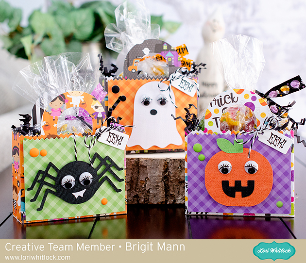
Welcome to Tutorial Thursday. Today I am sharing some HTV (heat transfer vinyl) tips with the Silhouette Studio software.  You can also cut HTV with other machines. Here is what we are making!

Let’s get started.  First, find your files and fonts to create your shirt.  I used these files for this shirt:

LW Longhand Font (SVG, Silhouette)
LW Perfect Type Font (SVG, Silhouette)
Feet from Coming Soon (SVG, Silhouette)
Halloween Witch Hat (SVG, Silhouette)
Halloween Bats (SVG, Silhouette)

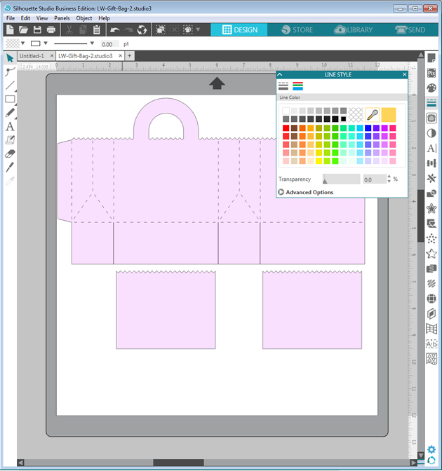
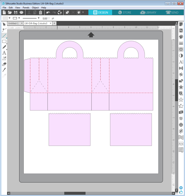
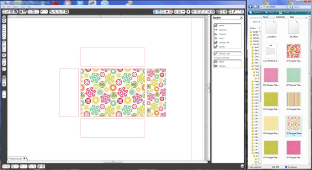
I typed Kick or Treat, and then added the other elements. In your design software, make a background box that will be the color of your project.  This will help you visualize the colors.

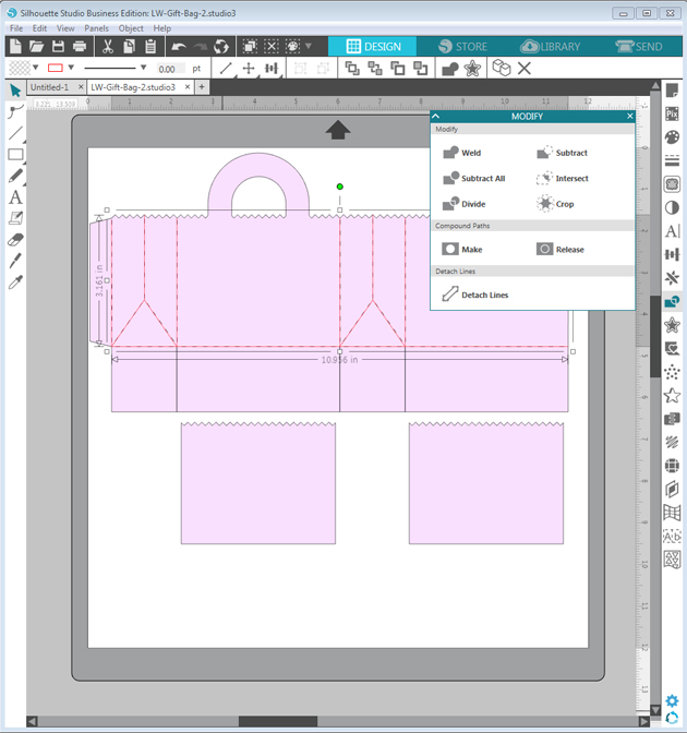
This looks ok, but I really wanted the colors to pop out more from the background.  This is where the Offset feature is used in Silhouette Studio.  I moved the background, and then selected the project. Then I used the Offset function which is the star Icon on the right side menu.  This is the Offset Settings Panel:


For this project I used Offset, changed the distance to 0.085 inches and selected the round option.  Click apply.


In this image, the red outline shows the offset.  Now it’s almost ready to cut.  Now separate each color and flip your project horizontally before cutting. The white offset layer is perfect in helping you line up all your other layers.

You will apply the HTV to your shirt or project working from the back color to the front with one color at a time. In this project, the first color to be applied is white.  I heat each layer for about 15 seconds instead of the full recommended time.  Then on the last layer, I apply heat for the full recommended time.  In my project the white layer is the largest, so I kept the clear transfer tape and used it to cover the whole project with each new layer. It is such a fun Halloween shirt for my sister!

You can create your own HTV project for less this week!  All SVGs, Fonts and commercial licenses are 30% off when you use code OCT2020 at checkout!

Have a great day!

Score Line Tutorial with Brigit

Hello, everyone, it’s Brigit here, I have a quick tutorial on how I replaced the score marks on the Gift Bag 2 file from Lori’s shop using Silhouette Studio Business Edition so I could use the scoring stylus tool on the Cricut Maker.
You can get the file here from the Silhouette Design Store, but for this purpose, I’m using the svg from Lori’s shop and I’ll explain why. I use Silhouette Studio Business Edition to design my projects even if I’m going to cut from one of my other cutting machines. I really like the Silhouette Studio software and with the Business Edition I’m able to save my projects as an svg which I can then upload into Cricut Design Space or Brother Canvas, you can’t do that with the Basic or Designer Editions and you can’t open svg files with the Basic Edition. What you can’t do with the Business Edition is use an image from the Silhouette Design Store and save it as an svg, the lines around the whole image will save as score marks so that’s why I’m not using the bag from the Silhouette Store. Cricut Design Space does have an option to add score lines but I like this way much better.
After opening the bag the first thing I do is change the fill to a lighter color and the lines to black, this way the new lines I put in will show up as red, makes it easy to line up.
I just quickly add lines over the score marks, I’m not exact here, I fix them and add the diagonal lines when I zoom in.
Zooming in I draw the diagonal lines and align all the other ones as close as I can get.
When I’m done I select the new lines and make a compound path, if I don’t do that when I upload to Cricut Design Space the score lines are off from the project.
I finish by ungrouping the bag, deleting the original score marks and group with the new score lines. I select all and go to file and save selection to hard drive and in the save as type select svg.
When I upload the bag into Cricut Design Space the size is much smaller, so I resize to match what it is in Silhouette Studio, then ungroup, new lines I created to score and select the bag and score lines and attach.
Here’s a closer look at each bag, I dressed them up with the characters from the Cute Halloween Set from Lori’s shop and here from the Silhouette Design Store.
The paper I used is from Doodlebug Design’s Booville collection and Gingham-Linen Petite Prints.
The eyes I believe I bought at Michaels and the sentiment is a stamp from My Creative Time.
Thanks for stopping by and have a wonderful day!!

How to Design Word Art in Silhouette Studio

Don’t you just love all the adorable word art you see everywhere you go? Take a look at Pinterest or a trip to the local store and there are fun phrases, quotes and sayings all over the place. Some are cut out of vinyl, others are printed, and some are an online graphic. You can create these fun phrases in Silhouette Studio (even if you don’t have a Silhouette machine). You can download the software for FREE and use it to create printable projects! Once you have this amazing program all you need is some fun fonts to work with. I have to admit, I collect a lot of fonts so I have plenty of options when I start working on a project. I like to get them at a good price like the ones over at FontBundles.

While word art may look easy to create, it can be time consuming and a little overwhelming with when you actually start working on one. How do you combine fonts effectually to create hierarchy and visual interest? There are some graphic design rules to follow that can help you combine fonts in a pleasing way. Hopefully these tips will help when you tackle your next typography project!

Be sure to watch the video tutorial HERE as I demonstrate how to design this cute word art…

Contrast

Create contrast by combining fonts that are different but compliment each other. However, remember that one of the fonts should take the lead and the other should be a supporting font.

  • Combine different styles like serif/san serif.
  • Combine fonts with different moods like modern/classic or formal/informal.
  • Combine different font weights such as a heavy headline with a lighter body font.

Harmony

Create harmony by combining fonts with similar elements.

  • Combine fonts with similar moods.
  • Combine fonts with similar proportions such as x-height, ascenders /descenders, and kerning (the space between the letters).
  • Limit the color scheme to a range of harmonious colors (use the color wheel).

A couple of rules of thumb: 

  • Avoid combining multiple san serif fonts unless they are very different from one another.
  • Avoid combining multiple script fonts because they are so strong that they will compete with each other.

Creating your own word art can be so rewarding! You can really make some fun projects out of phrases and words when fonts are combined properly. Follow these tips I’ve given you, use your own creative judgment, and have fun!

Do you like the fonts I’m showcasing here in this blog post? They come from the awesome Majestic Font Bundle that is available the next 20 days. It includes 40 magnificent fonts for $29. That makes them 72¢ per font. REALLY?? That’s a deal for a gorgeous set of fonts. Also, be sure to check out the Road to Summer Font Bundle while you’re there. And, at the very lest… be SURE to pick up the FREE font of the week HERE.

Majestic Font Bundle

Road to Summer Font Bundle

Have a great day!

Silhouette Tutorial with Brigit: Using Pattern Paper as a Fill in SSDE

Hi Everyone!!  A couple of people have asked me this question so I have a quick but helpful tip today, filling different size shapes with the same size pattern.  I chose this no glue rectangle box from Lori’s shop, it’s perfect because the side layer pieces are smaller than the top.


The flower is from the 3D flower Set 8 and digital paper is Lori’s Maggie collection.

Stamp sentiment is from Jaded Blossom Stamps.


The first thing I do is ungroup the pieces, the score lines of the box are separate but I want to keep that all together so I select around the box and then choose Make under the Modify window or you can right click and Make a Compound Path.


Now onto the layer pieces, they are still grouped together, if you select your pattern paper it will fill all the shapes at once but the 4 layer sides will be smaller and I want them all the same size.


(I don’t import my paper into SSDE, as you can see in the right-hand side I have it sorted on my computer in folders and keep it opened next to my program for easy access and drag and drop it into my shapes.  This way it only fills one shape at a time when it’s grouped.)


So what I do is select all my shapes and Make a Compound Path, then when I fill with pattern paper it fills all the pieces at once and the pattern size is all the same also.  That’s it, simple!!


Then you can resize it all at once in the advance settings under the Fill Pattern Window if you’d like.


Thanks for stopping by, I hope you find this tip helpful!  You can visit me at http://www.brigitsscraps.com.