“Faux Stamping” with Dingbats Technique by Michelle

Cozy up with the Winter Dingbat Font and make these sweet little stocking-stuffer notebooks!  This is Michelle Zerull and I’d like to share a pocket sized project that can made in practically no time at all.  Perfect for stockings, classroom gifts and coworkers. Make one for yourself too!

For these mini notebooks, I used “A Perfect Winter” papers by Echo Park.  The colors and patterns are great for the holidays and beyond. For the “Faux Stamped” covers, I downloaded the Winter Dingbat Font which can be found in the Silhouette Design Store and also at Lori Whitlock’s SVG Shop.  The books themselves were made from the 2×2 Accordion Mini Album SVG files that can be found here in the Silhouette Design Store and also here at Lori Whitlock’s SVG Shop.  Lori has an excellent Tutorial Video where she shows how to assemble the books. Be sure to watch the seven minute video for Lori’s tips and tricks! I’ll show you here, how to use the adorable Winter Dingbat Font to make the book covers.

I’ve been a rubber stamper for over 20 years.  I love the look, but I hate stamping on my favorite patterned papers.  I’m always afraid that I’m going to get a bad impression and ruin them.  Sadly, it happens.  By using the Winter Dingbat Font, I know that I’m going to get a consistently perfect image every time without actually stamping.  The Winter Dingbat Font contain 26 images and phrases that can be cut, colored and printed in any size your heart desires!  Yes, that’s right…26 images…in ANY size!  This “Faux Stamping” technique is so easy to do with the print and cut feature on my Silhouette Cameo.  It’s my latest obsession!

After downloading your font and SVG design, open up your design area and type in the alphabet using your dingbat font.  Look at all of those images! The hard part is choosing which ones to use!  For this project, I’m going to use three of the phrases. I clicked on the designs, clicked on the fill tool and chose the color black.  I ungrouped all 26 images and deleted the images that I was not going to use.

Next, I opened the 2×2 Accordion Mini Album files. I’m going to cut them all eventually, but right now, I’m working with the covers. I ungrouped the pieces and set them off to the side for later.

I copied the teal front cover piece and made three covers. (I made a lot of little books!)  Move your phrases to the front of the covers and remove the cut lines by selecting “no cut.” Important! Remember to remove the teal color from your pieces and change it to transparent. At this time, I also changed my page setup.  I don’t have a 12×12 printer, so I am going to cut my 12×12 patterned paper down to 8.5×11 so it will feed through my printer.  In order for the Silhouette to read the registration marks, you will need to choose a light colored patterned paper.

Add your registration marks to your letter sized page setup.  Place your light colored 8.5×11 patterned paper in your printer and hit “print.” Voila! Perfectly printed on patterned paper!  Now you can put this sheet through the Silhouette Cameo for perfectly cut book covers that already have the phrases printed, or “Faux Stamped”on them.

Cut and assemble the other pieces like Lori shows in the tutorial video. Instead of using designer paper for the pages, I chose to use plain white pages so I could make them into mini notebooks.

I hope that you enjoyed my “Faux Stamping” with Dingbats technique. The dingbat fonts are so fun to play with!

Print and Cut Labels

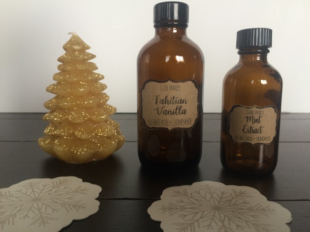
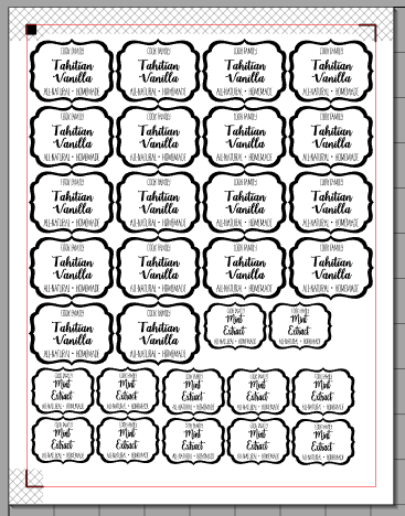
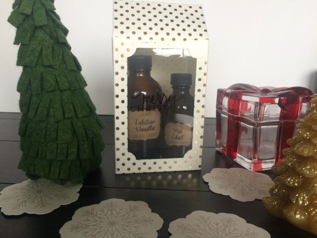
Welcome to the weekend.  I hope you have fun plans.  Christmas is almost here.  This year, I made some extracts to give as gifts.  I followed instructions from Our Best Bites.  I started back in September, so I hope they are ready to give.  I used Lori’s Pantry Labels to make up a quick label.  I used the new Darling Font for the extract name, and I used Dreamy Font for the other text.


Hope you get some of your list checked off this weekend. The Blog Hop sale is still going, so grab up those last files needed for your Christmas projects.


How to Design Word Art in Silhouette Studio

Don’t you just love all the adorable word art you see everywhere you go? Take a look at Pinterest or a trip to the local store and there are fun phrases, quotes and sayings all over the place. Some are cut out of vinyl, others are printed, and some are an online graphic. You can create these fun phrases in Silhouette Studio (even if you don’t have a Silhouette machine). You can download the software for FREE and use it to create printable projects! Once you have this amazing program all you need is some fun fonts to work with. I have to admit, I collect a lot of fonts so I have plenty of options when I start working on a project. I like to get them at a good price like the ones over at FontBundles.

While word art may look easy to create, it can be time consuming and a little overwhelming with when you actually start working on one. How do you combine fonts effectually to create hierarchy and visual interest? There are some graphic design rules to follow that can help you combine fonts in a pleasing way. Hopefully these tips will help when you tackle your next typography project!

Be sure to watch the video tutorial HERE as I demonstrate how to design this cute word art…

Contrast

Create contrast by combining fonts that are different but compliment each other. However, remember that one of the fonts should take the lead and the other should be a supporting font.

  • Combine different styles like serif/san serif.
  • Combine fonts with different moods like modern/classic or formal/informal.
  • Combine different font weights such as a heavy headline with a lighter body font.

Harmony

Create harmony by combining fonts with similar elements.

  • Combine fonts with similar moods.
  • Combine fonts with similar proportions such as x-height, ascenders /descenders, and kerning (the space between the letters).
  • Limit the color scheme to a range of harmonious colors (use the color wheel).

A couple of rules of thumb: 

  • Avoid combining multiple san serif fonts unless they are very different from one another.
  • Avoid combining multiple script fonts because they are so strong that they will compete with each other.

Creating your own word art can be so rewarding! You can really make some fun projects out of phrases and words when fonts are combined properly. Follow these tips I’ve given you, use your own creative judgment, and have fun!

Do you like the fonts I’m showcasing here in this blog post? They come from the awesome Majestic Font Bundle that is available the next 20 days. It includes 40 magnificent fonts for $29. That makes them 72¢ per font. REALLY?? That’s a deal for a gorgeous set of fonts. Also, be sure to check out the Road to Summer Font Bundle while you’re there. And, at the very lest… be SURE to pick up the FREE font of the week HERE.

Majestic Font Bundle

Road to Summer Font Bundle

Have a great day!