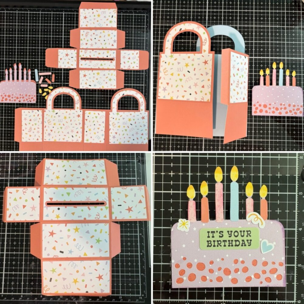
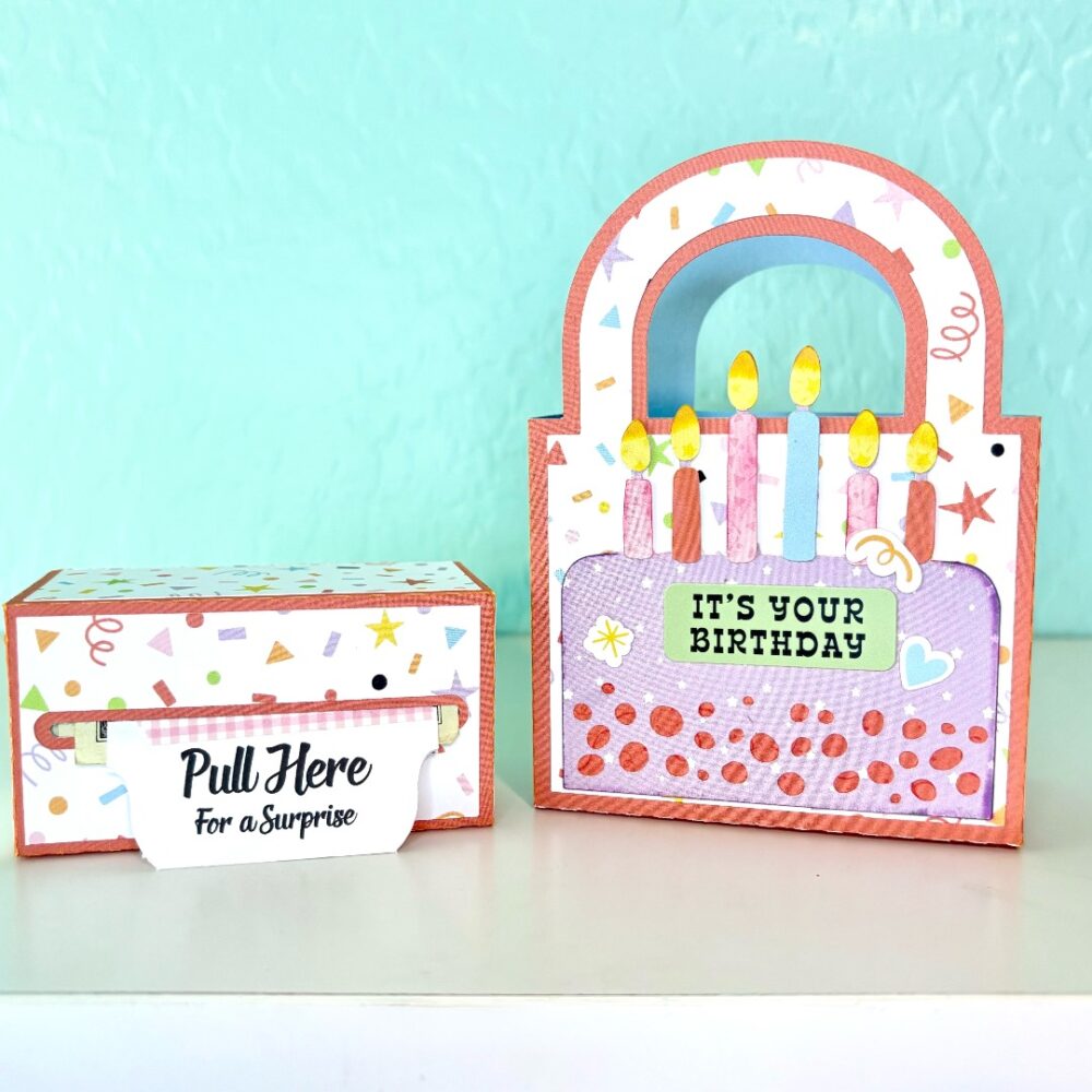
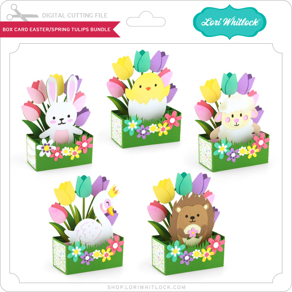
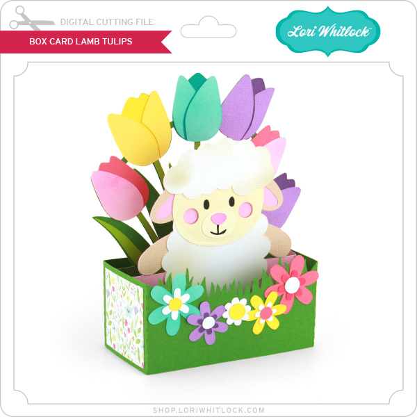
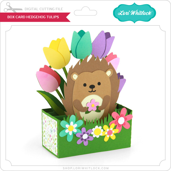
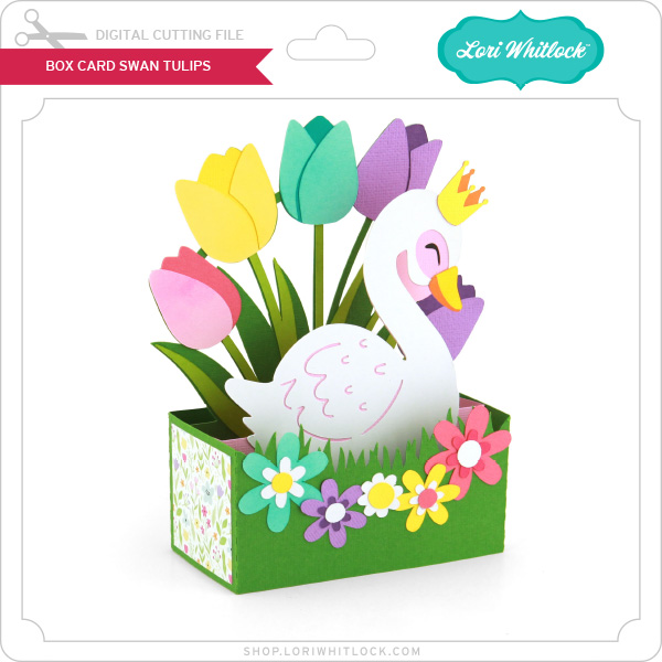
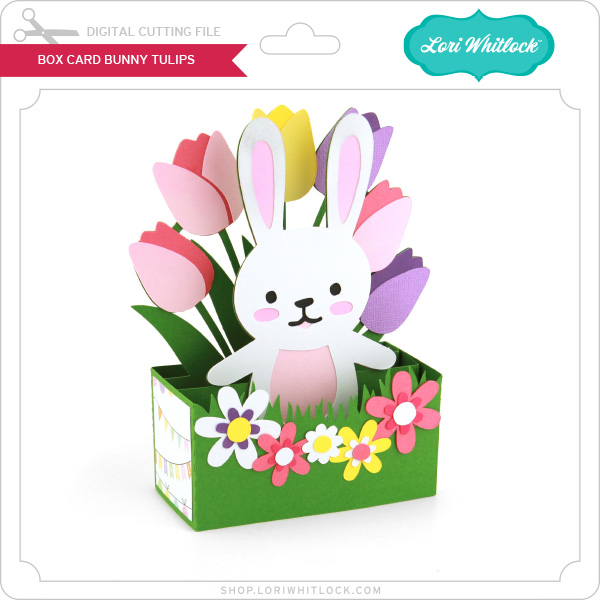
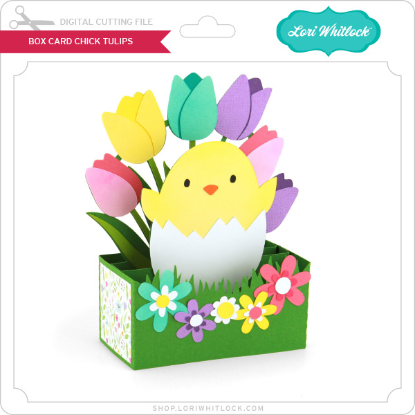
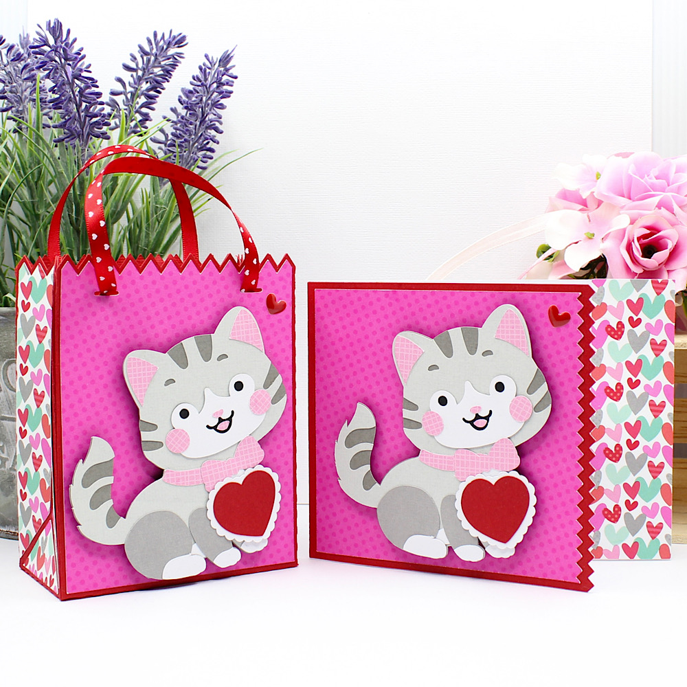
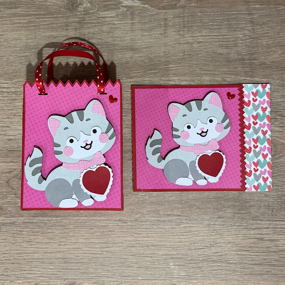
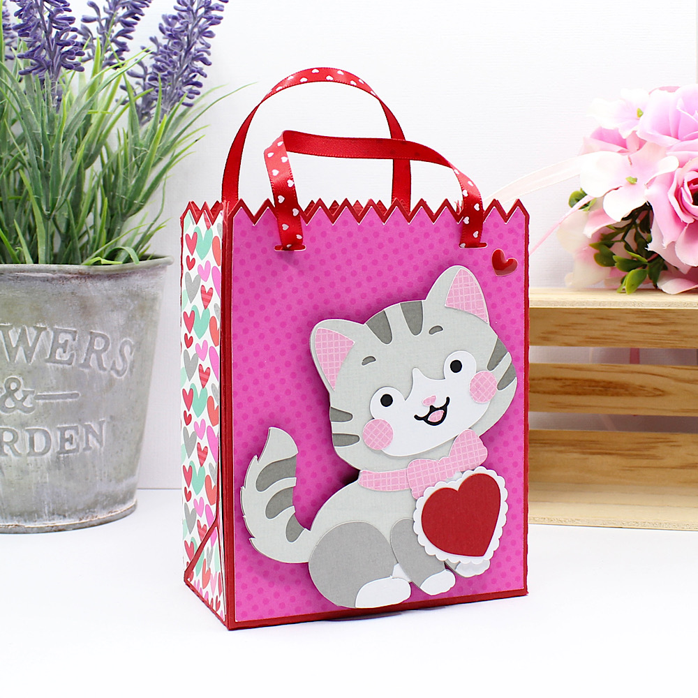
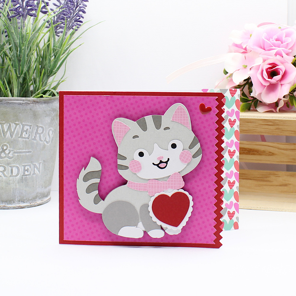
Hello Crafty Friends, Noelene here today! I want to share with you a super cute box card using an adorable fellow Aussie!
Hey everyone!
I’m excited to share my latest creative adventure with you: a fun print and cut project! I know that for many people, the idea of print and cut can seem daunting. But let me assure you, it’s actually a lot easier than it looks!
Files: SILHOUETTE/SVG
When I first started, I was intimidated by the idea of aligning everything perfectly. I thought I’d end up with wonky cuts and wasted materials. However, after diving in, I found it to be incredibly easy!
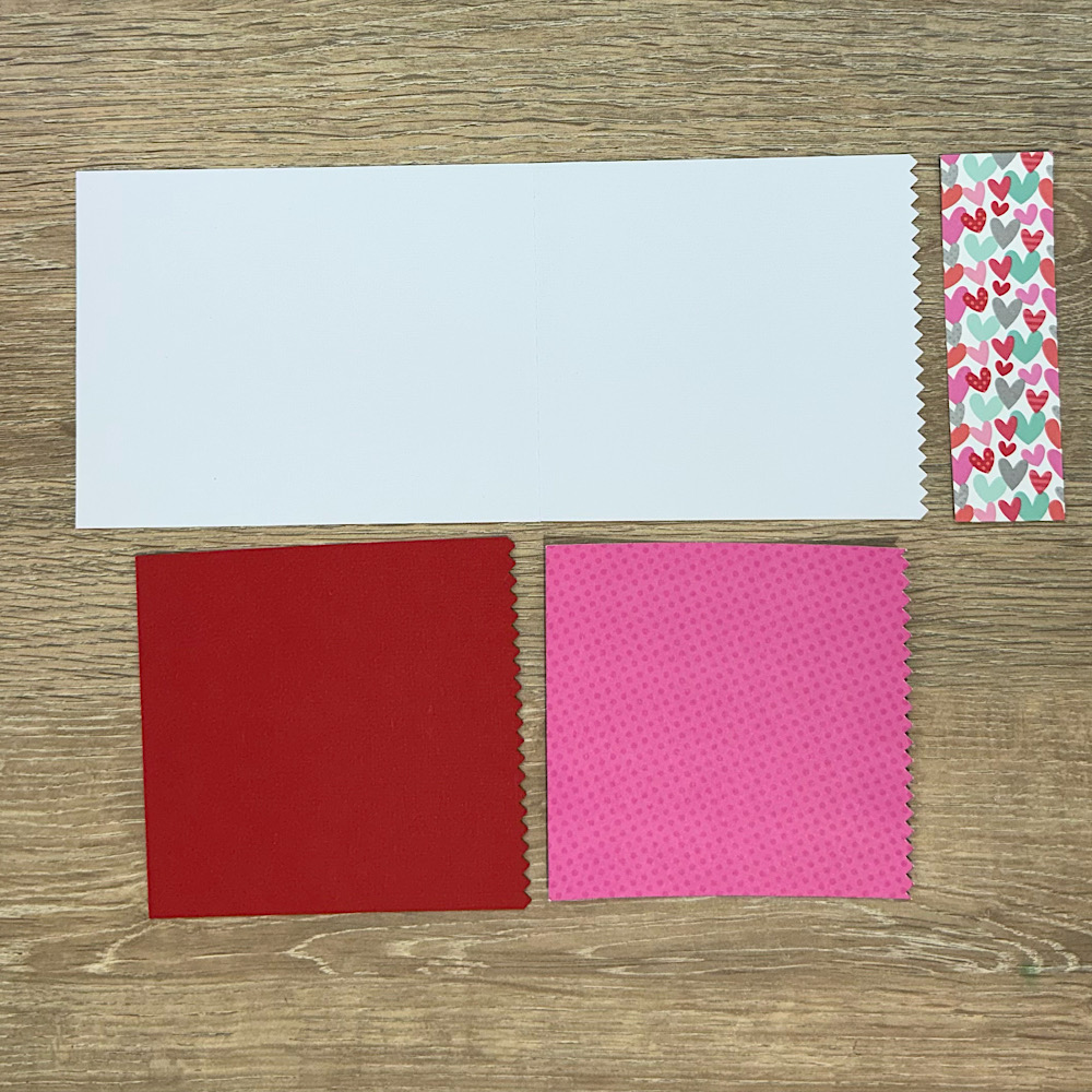
Cutting the cardstock pieces:
I love to cut as many colors that I can on 1 mat, so I place more than one color on a mat.
Print:
After I sorted the printable items of my design, I printed it out on quality paper. The key here is to ensure your printer settings are correct for the best results. I used semi glossy photo paper.
Cut:
After printing, I loaded the paper into my cutting machine. so my machine could cut the images!
Putting the card together:
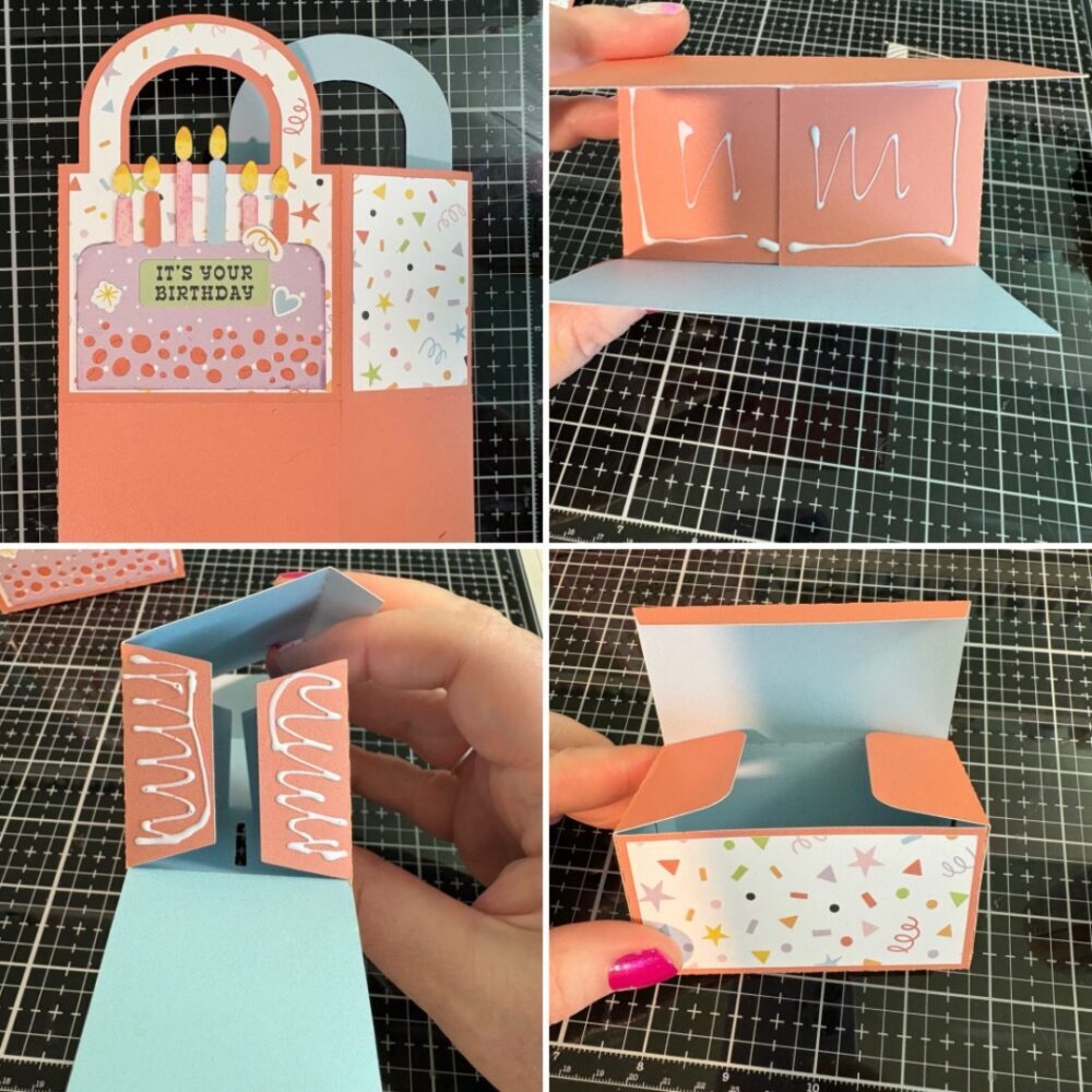
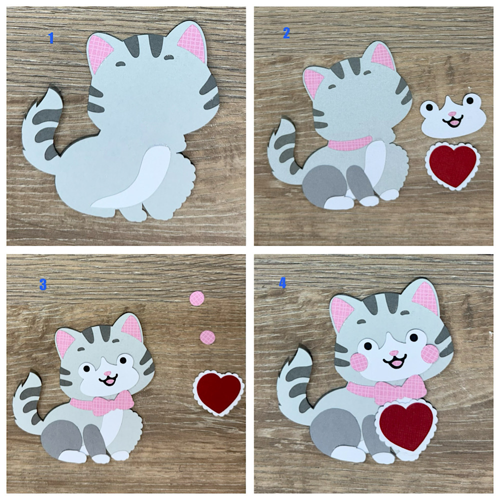
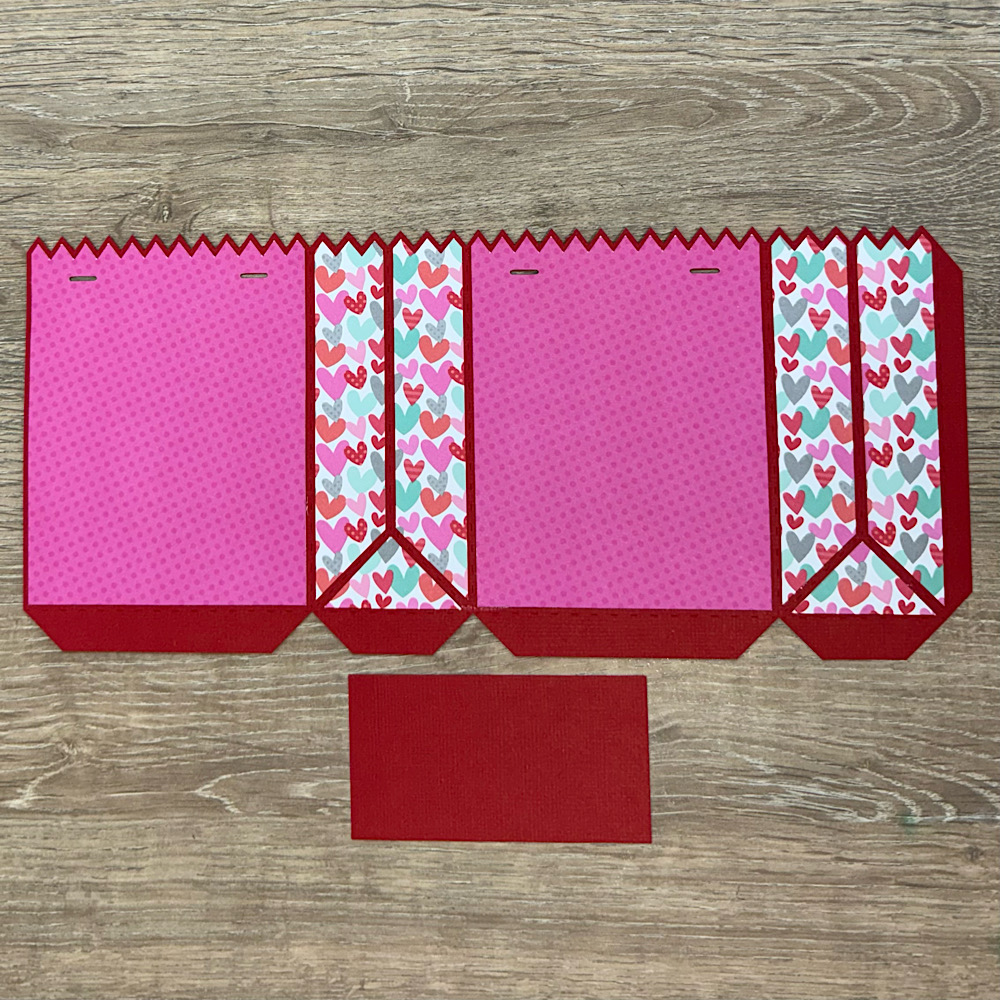
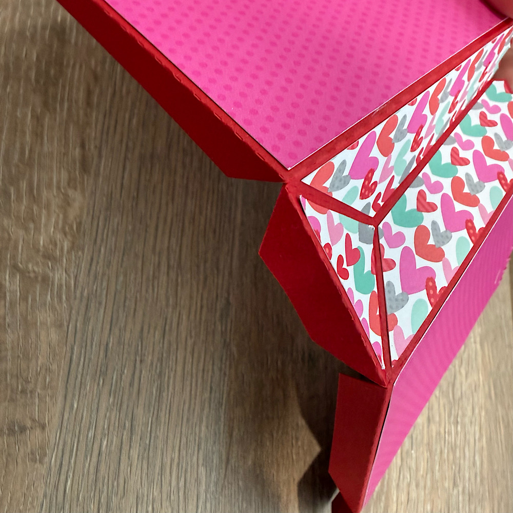
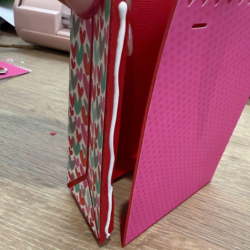
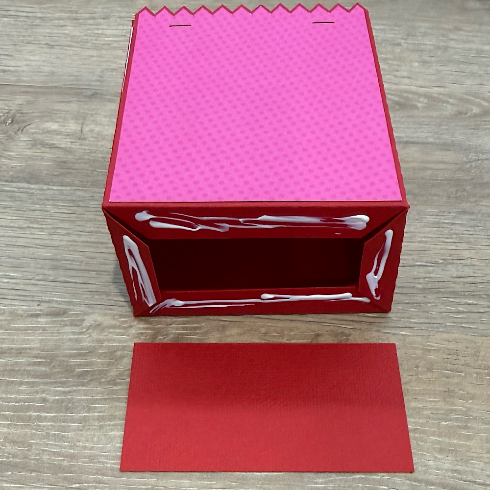
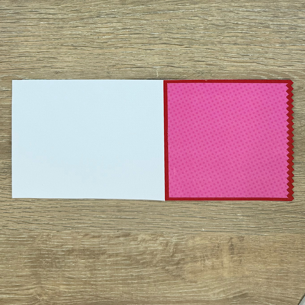
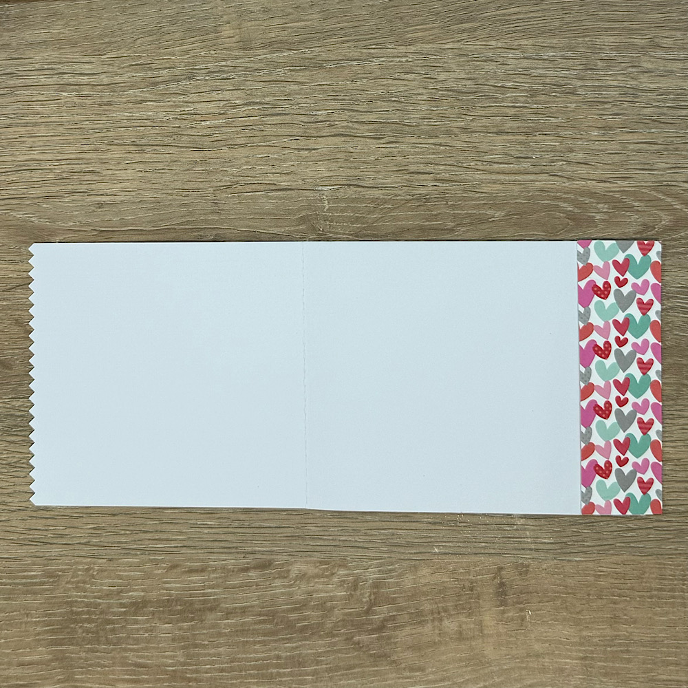
The card elements are super easy to piece together, as you can see in the photos below!
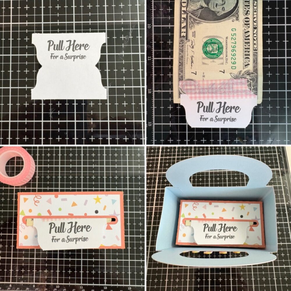
After you glued these parts together you can start to add the print and cut elements, and decorate the outside panels.
If you’re considering trying a print and cut project, here are a few tips to help you along the way:
Use Quality Materials: Good printer paper and ink can make a huge difference in the final result of the printed images.
Practice: Don’t be discouraged if your first attempt doesn’t go perfectly. Each project is a learning opportunity!
I truly enjoyed my print and cut project, and I can’t wait to make more. Remember, it’s all about having fun and experimenting with your creativity. So, if you’ve been hesitant to try print and cut, I encourage you to jump in! You might just surprise yourself with what you can create. And there are so many cute Print and cut projects in Lori her shop, go take a look!
Happy crafting! Tamara
Hi everyone!
The holidays are just around the corner…hard to believe they are sneaking up on us so fast. I had fun in my little studio creating this adorable box card. It’s Lori’s A2 pumpkin pie flower box card or you can find it here In the Silhouette Online Design Store. It’s just too cute with that little crust edge…love it.
I used Lori’s Echo Park I Love Fall collection. I have used this collection over and over, it is just perfect for everything this time of year.
Did you catch our latest Friday Five Dollar Bundle? These five beautiful and charming cards are extreme pop-up cards, each filled with festive cheer. Inside, you’ll find a charming snow globe snowman, jolly Santa Claus, a whimsical snow globe reindeer, a snow globe Christmas tree atop a car, and a spooky haunted house. These cards fold flat for easy mailing in an A7 (5×7) envelope, making it simple to send some holiday magic to someone special. Don’t miss out as this deal is only available until Sunday at midnight. Check out our tutorial HERE to get started on creating these fantastic extreme pop-up cards!
** Because Friday $5 Bundles are already heavily discounted they are not eligible for further discounts including monthly, seasonal and flash sales.
Have a great weekend!
Lori
Welcome to my Thursday Tutorial !
We are so close to Halloween and I’ve always wanted to make this Halloween Scene Decor file (Lori Whitlock Store or Silhouette Store)-so here it is. It’s actually very easy but it is a decor file so it is much bigger than normal creations.
Here it is all done! It’s over 18 inches long and very cool!
Here you can see the six panels. The bottom three panels are glued on top of the main panels.
You will cut 6 panels with different scenes. They are big–11.5 inches tall and a bit over 6.5 inches wide for each panel. Plan on using 6 pieces of black cardstock with extra left for other projects. I used Michaels paper 65lb cardstock because it cuts details so well, but it wasn’t really strong enough for this stand up scene. My solution was to cut 3 extra panels for a bit more extra strength. I would suggest using heavier paper and all will be good!
You will glue the three full scene panels together. Two panels have a tab. Glue those together and then add the third panel. I would then glue the other three top panels to the main panels, making sure to line up the elements.
You can cut the top panels different colors but I stuck with all black for the panels and changing up the colors for the paper piecing. You can see all the pieces laying on the glued panels so you can see the placement .
Here you can see where all the pieces should be placed. I did cut a purple spider for that third panel for a little more color balance. To isolate the spider I made a copy of that panel (in the Silhouette software hit the Ctrl key and arrow key to make a copy of the selected piece you want) and then I used my knife tool and cut it out of the panel. A little extra trimming with my scissors after it was cut and I was ready to add it to the panel. My favorite pieces of this file are the little brown door boards. They even have itty bitty nail holes at each end! Such detail!
I also used a brick stencil on my buildings to make them look like haunted castles. Scuffed up the rest of the pieces with black chalk and then glued them on. I found a little black bat on my floor so had to add that LOL! I have a lot of Halloween things floating around. Ha! I think it would be fun to add velum behind each panel and then add lights behind it…I might still do that!
I’m excited to add this to my Halloween decorations-it will look spooky on my mantel!
Sue